Onsite marketing is a way to increase ecommerce visitor engagement and sales by focusing on customer data and personalization. With ad costs skyrocketing, focusing on converting existing traffic is as important as ever.
How does onsite marketing differ from traditional visitor engagement strategies?
Unlike traditional tactics, onsite marketing relies on detailed customer segmentation data to track their path from discovering your store and products to making a purchase and beyond. That data helps create personalized experiences that show your customers they are valued and understood, ultimately building loyalty.
What is onsite marketing?
Onsite marketing is an ecommerce marketing strategy that involves engaging and converting website visitors through targeted campaigns tailored to their behavior and data. This includes factors such as how they discovered the website (organic or paid traffic), their purchase history, and the pages they are visiting or have visited.
Ecommerce businesses using onsite marketing integrate engagement tools like popups, onsite notifications, chatbots, landing pages, live chat, and signup forms, into one strategy. This cohesive approach aims to deliver personalized shopping experiences, driving engagement and conversions.
Onsite marketing examples
- Targeted onsite promotions
- Strategically placed embeds
- Onsite notifications
- Upsell for subscription businesses
- Contextual promotion of loyalty programs
- Separate campaigns for mobile visitors
- Gamified campaigns
- Exclusive offers for loyal customers
- Using multiple channels for one purpose
- Non-sign-up campaigns for shopping experience
1. Targeted onsite promotions
There are many benefits of using targeted promotions for ecommerce stores. You can make the shopping experience more engaging and relevant. Also, you’ll be able to make product discovery quick and easier for customers, ultimately increasing sales.
Examples of targeted onsite promos:
- A message with a link to a product a customer viewed but left without buying (appears only to that customer).
- A promo message with related products shown after a customer adds a specific product to the shopping cart.
- A personalized discount code to a customer who visited your store three times but never added a product to the cart.
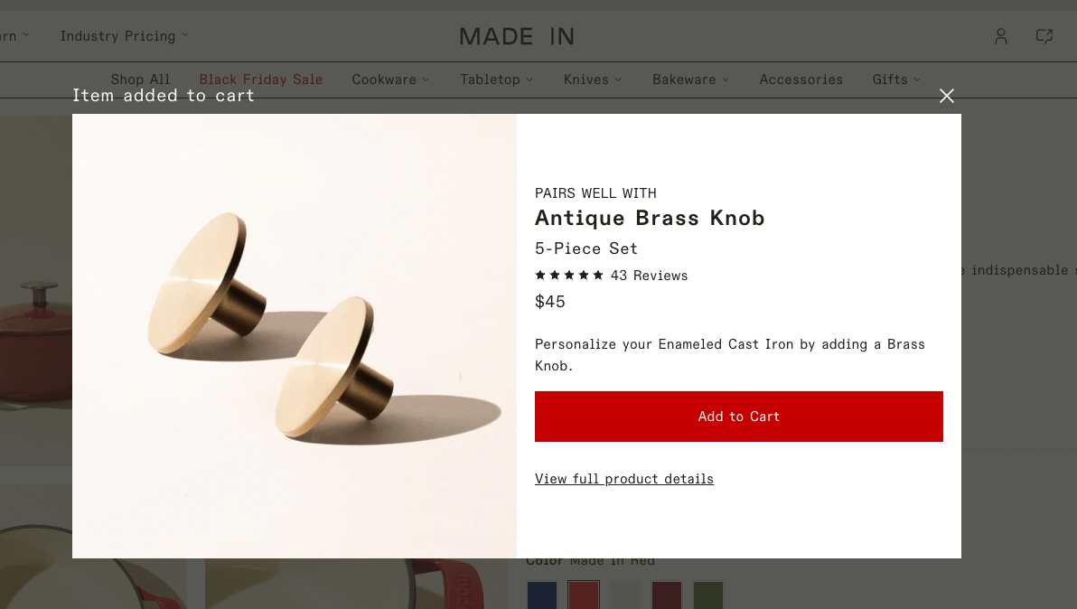
This offer can appear if a customer adds a product to the cart (you can increase the average order value and improve product discovery this way). To make such onsite marketing examples, you’ll need to use targeting options in your marketing apps:
- Choose visitor groups to target (paid traffic, new/returning customers, customers who bought from you X days ago, etc.).
- Create personalized offers or messages for each group (a discount code, free shipping, a simple reminder of a product, etc.).
The next example, highlights if a customer visited a product but left without buying, a promotion like this will be a great way to remind them and encourage them to reconsider buying.
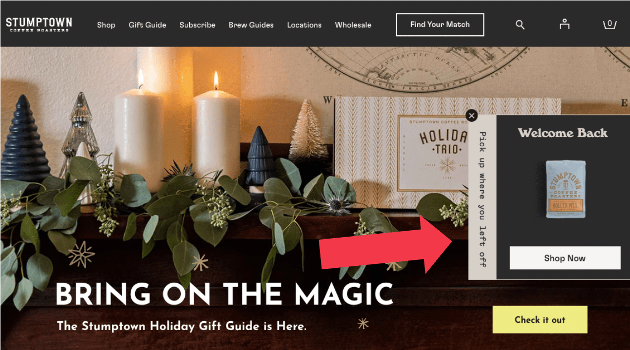
Choose an onsite tool to share your messages (this could be website popups, upsell apps, automated chatbot messages, or website banners).

2. Strategically placed embeds
Embeds are signup forms that you can place (or “embed”) almost everywhere on your ecommerce site without coding. You can embed forms like:
- Newsletter signup forms
- Banners with time-limited marketing offers
- Spin-to-win contests
- Discount code applications forms
Embeds make it really easy to increase the chance that your marketing message will be seen at the right time by the right customers. Besides, it’s a good way to engage visitors in case your website has active popups (or you don’t want to use popups altogether).
Émoi émoi, an online clothing store, promoted a special B2GO (Buy-two-get-one-free) offer. To get the free item (socks), customers needed to choose a size and add the promo code to the cart. To make this task easy, émoi émoi placed embeds on product pages (only for items that were eligible for the offer).
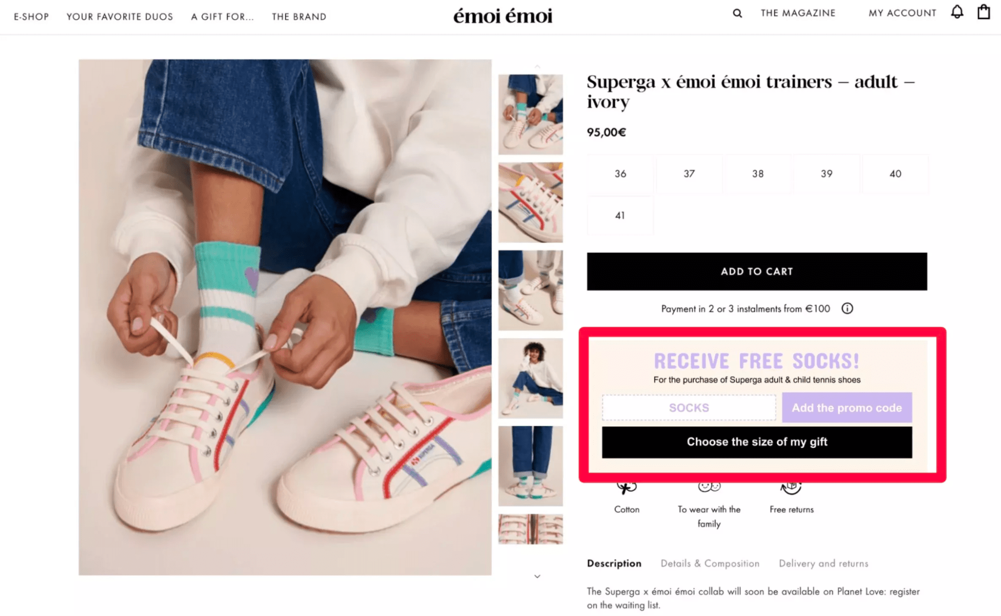
Besides being a great onsite marketing tool, embeds can also be configured to be shown only to customers who meet certain criteria. For example, an embed with a promo offer only for regular visitors on pages with a new collection could be a good way to get repeat customers.

3. Onsite notifications
Onsite notifications are a social media-inspired website feed equipped with visitor targeting and marketing features. Black Ember, an online store that sells tactical backpacks, drives traffic to pages with new products and special offers.
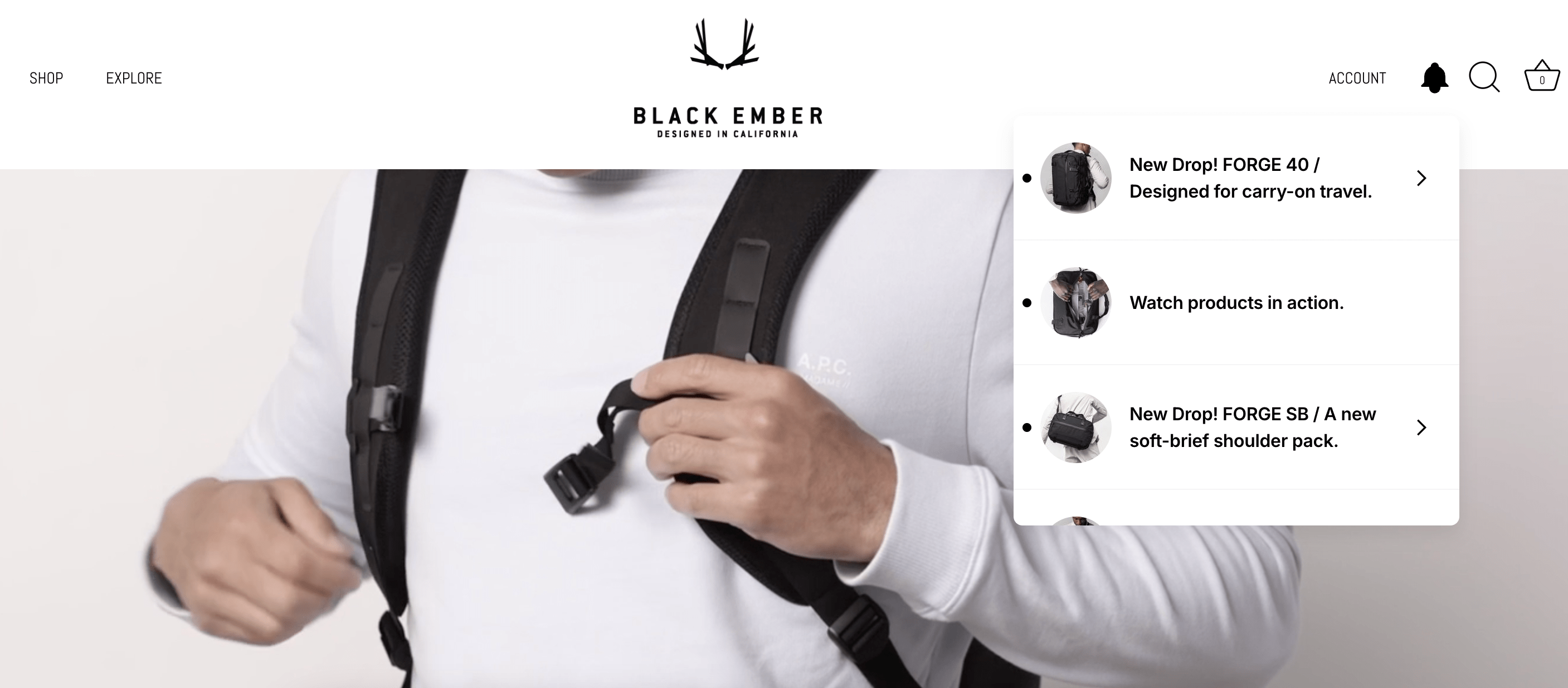
Onsite notifications are a completely new way to engage visitors on ecommerce websites that come with very useful benefits:
- Give discount codes to your visitors.
- Convert visitors into newsletter subscribers.
- Announce new product releases and collections without cluttering the homepage.
- Drive traffic to pages with products, sales, collections, loyalty program explainer pages, your Instagram page, or landing pages.
- Share targeted messages with specific visitor groups (e.g. a free shipping promo to those who add a product to the cart).
Making every onsite notification campaign targeted is also possible (and necessary to make them as engaging and relevant as possible). You can use your customer data and the targeting options to create personalized campaigns for every visitor group.
4. Upsell for subscription businesses
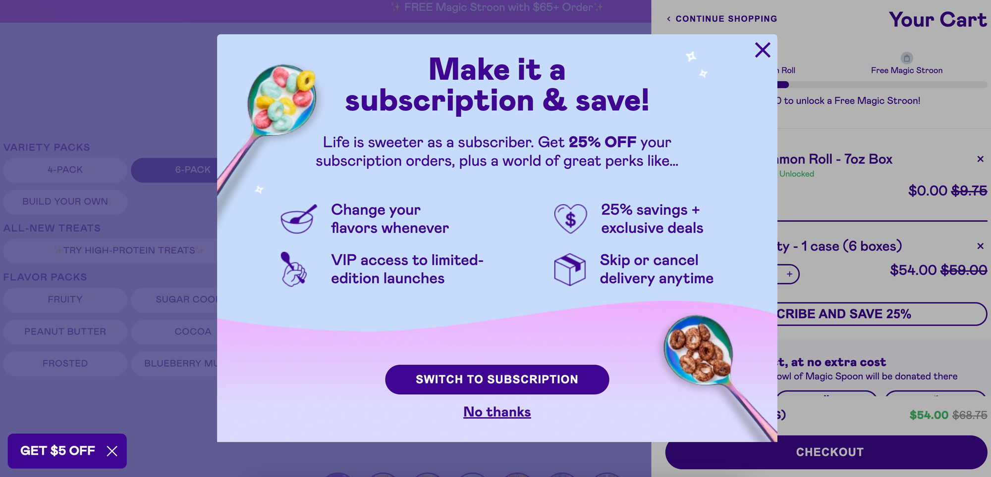
Suppose a customer is considering buying but opts for a one-time delivery option instead of subscribing. This is fine, of course, but you can still make one final push and put every benefit of being a subscriber in front of them. Many businesses would just use a website banner or a website popup that appears immediately after a visitor lands on a website (which is not ideal, since an embed can easily share this info without interrupting the browsing experience).
Instead, we can create a campaign that appears only when a visitor adds the one-time option to the cart like Magic Spoon.
Creating such a campaign is also easy—you can either choose to show it when a visitor adds a product to the cart or just simply clicks on “Buy” on the one-time purchase page (the second option is done with the so-called “on-click popups”).
5. Contextual promotion of loyalty programs
The traditional way to promote loyalty programs is with homepage widgets, dedicated landing pages, and emails. And it still works well. But you can motivate more customers to join your loyalty program by making its promotion more context-based and personalized (which is what onsite marketing is all about).
Examples of such campaigns (could be displayed in banners, popups, or other tools):
- An invitation to join the loyalty program for customers who have not signed up for your newsletter that appears only on pages with sales (to encourage them to sign up to enjoy more benefits like being the first to know when a sale goes live).
- An exclusive offer to customers who bought X times (say, more than three) from you within X days. This way, you can encourage your loyal customers to buy more.
- A personalized discount that appears only to customers who spent $50 (or any other amount) in your store. This way, you can for example promote various bonuses in your loyalty program that customers can unlock by spending more.
- An announcement of new products and collections that are displayed only to registered customers (in case you’d like to show a welcome discount to unregistered ones, for example).
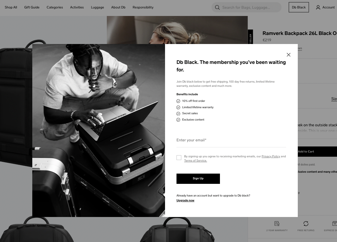
This popup with the loyalty program promo on Db Journey appears on the product page, which is an excellent idea since visitors browsing products are more likely to buy.
6. Separate campaigns for mobile visitors
More than 63% of ecommerce orders are made from mobile. That means mobile shoppers deserve special attention. Often, it’s worth experimenting with different marketing offers for desktop and mobile visitors—many businesses have found that the two channels perform differently.
Besides, it’s also about the mobile shopping experience. Google prohibits businesses from showing intrusive interstitials on mobile devices, which means we need to make our campaigns optimized.
Charlotte Bio, a cosmetics brand, promoted a flash sale using two campaigns— a desktop popup and a mobile-optimized version.
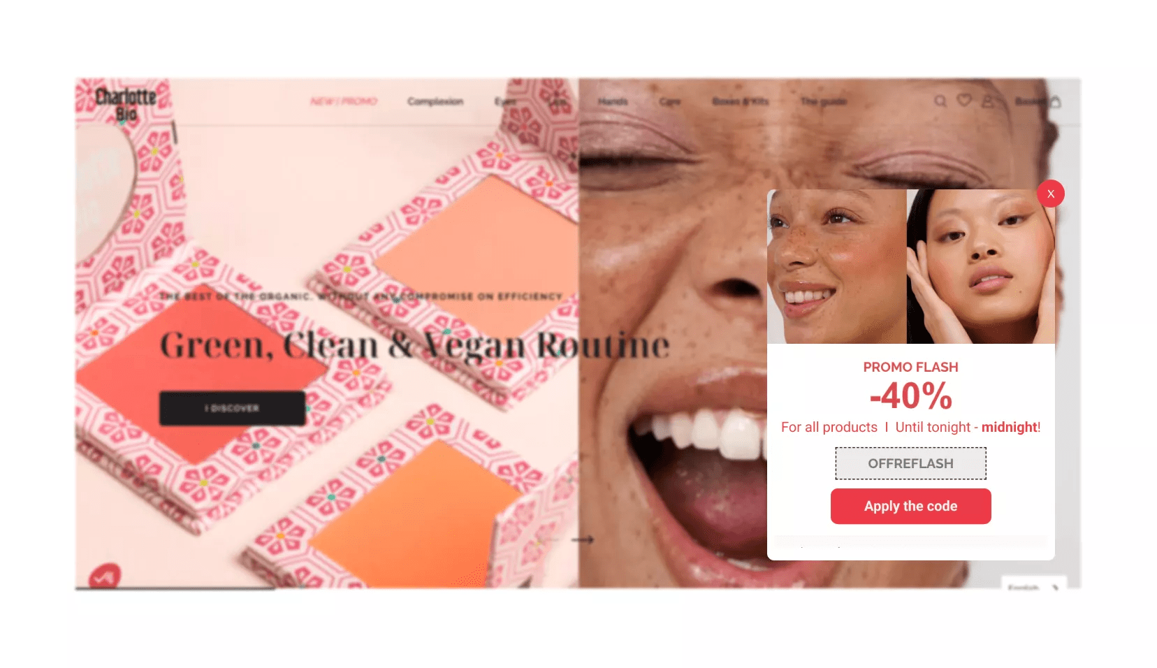
Both campaigns allowed shoppers to apply the discount code in one click—which was equally easy on both platforms thanks to the optimization. The desktop campaign generated 137 code applications, while the mobile one got 734, showing how important it was to optimize the appearance of the offer to smaller screens.

7. Gamified campaigns
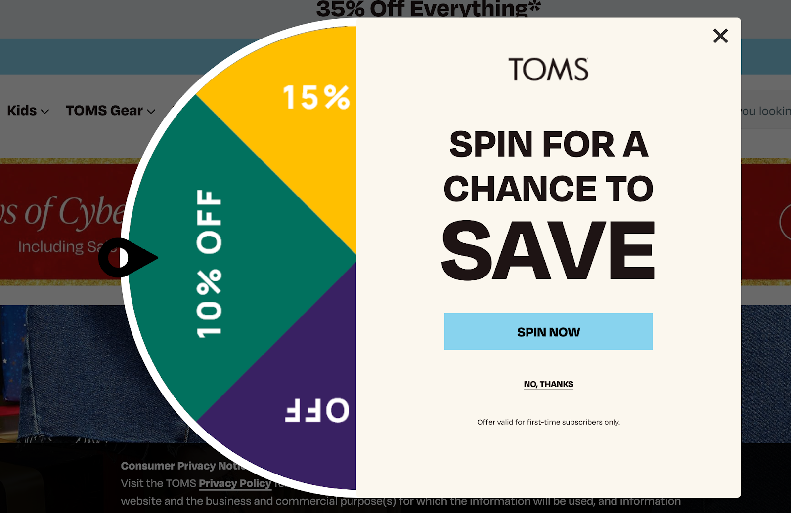
If used correctly, gamified campaigns like quizzes and spin-to-win popups can be very effective for lead generation and boosting sales. “Correctly” means using popup wheels for time-limited campaigns like sharing discounts during flash sales, BOGO offers, or giveaways, and quizzes to provide personalized product recommendations.
TOMS uses this campaign to engage unregistered visitors during sales.
8. Exclusive offers for loyal customers
This next tip may not sound like anything new. Your offers to loyal customers displayed on your store can be more targeted and strategic (and therefore more effective).
You can offer an additional 10% off for repeat customers only when they add a product to the cart as a thank-you for shopping with you.
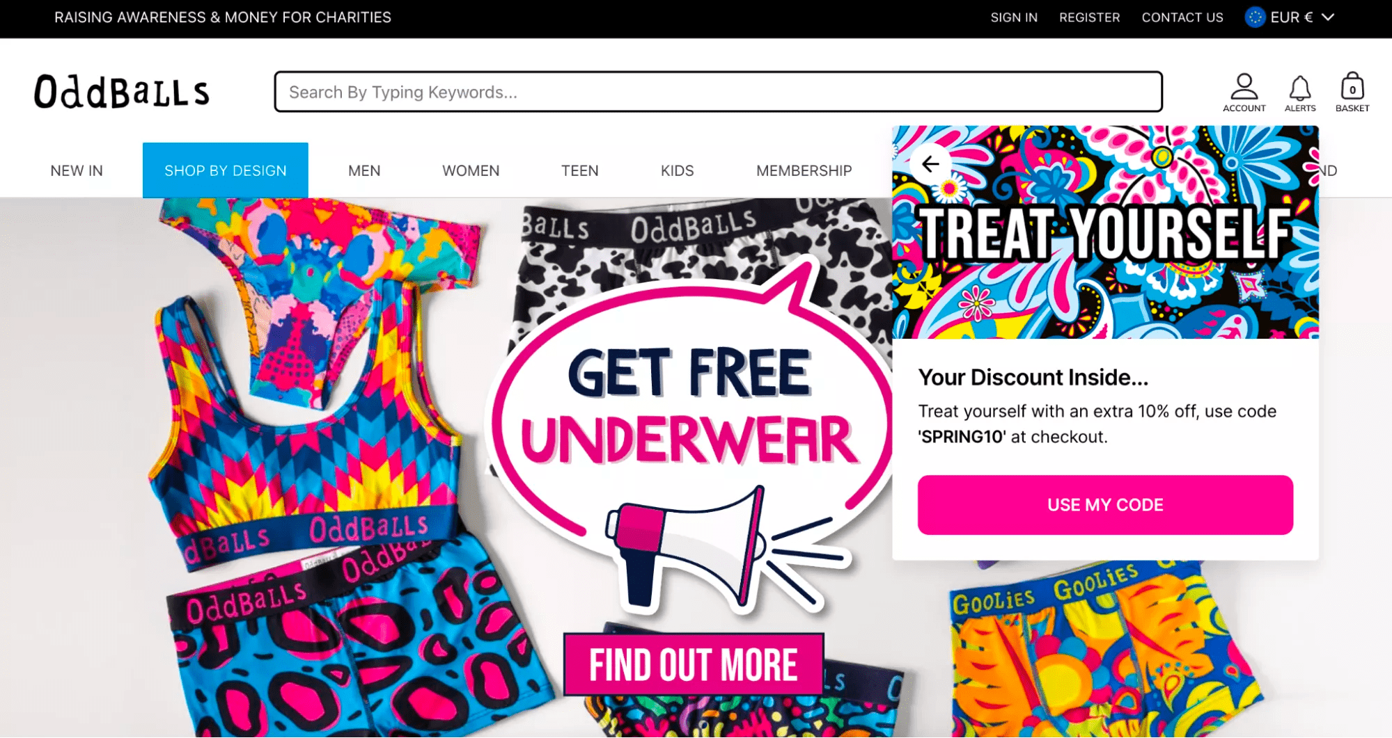
Or you can experiment with timing. For example, you can make a private “deal of the day” or “deal of the hour” for repeat customers and promote it with emails and on your website only to registered visitors.
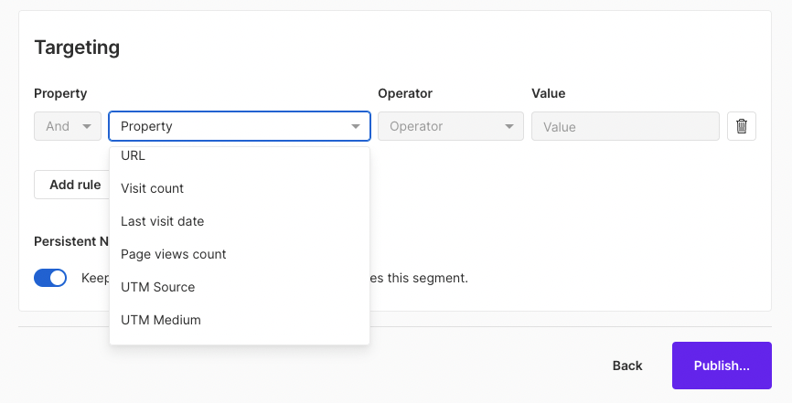
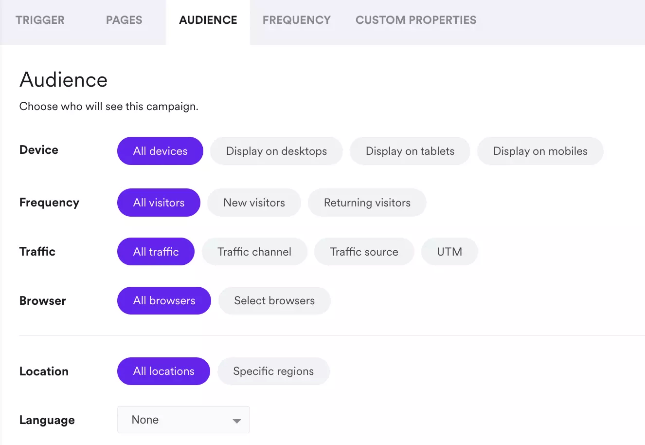
Once again, creating offers like that requires you to use targeting options and ecommerce properties in your onsite marketing apps. For example, here’s how popup targeting options look in Wisepops, an onsite marketing platform.
9. Using multiple onsite channels for one purpose
Live chat widgets, banners, email popups, bars, you name it—you have a lot of onsite marketing channels to engage your visitors with. We can combine two or more of them to help you achieve one goal.
A couple of examples:
- A popup and a website bar for time-limited sale promotions. For example, if the visitor closes the popup that contains the discount code, it will still be available in the bar at the top of the website.
- An embedded form and a landing page. You can place an embed promoting your loyalty program in the product menu page so visitors can use it to learn more about the rewards they can get for shopping.

10. Non-sign-up campaigns for shopping experience
“Non-signup campaigns” include onsite messages that are related to website navigation, driving traffic to specific pages, collecting customer feedback, and other goals where signing up is not required (like in a newsletter signup).
The goal here is to make shopping easier with personalization and get some helpful feedback from visitors. Here are some examples of onsite marketing campaigns from ecommerce:
- Exit surveys
- Popups with links to quizzes
- Net Promoter Score (NPS) survey forms
- Suggestion boxes with open-ended questions
- Forms with unique discount codes from your Shopify store
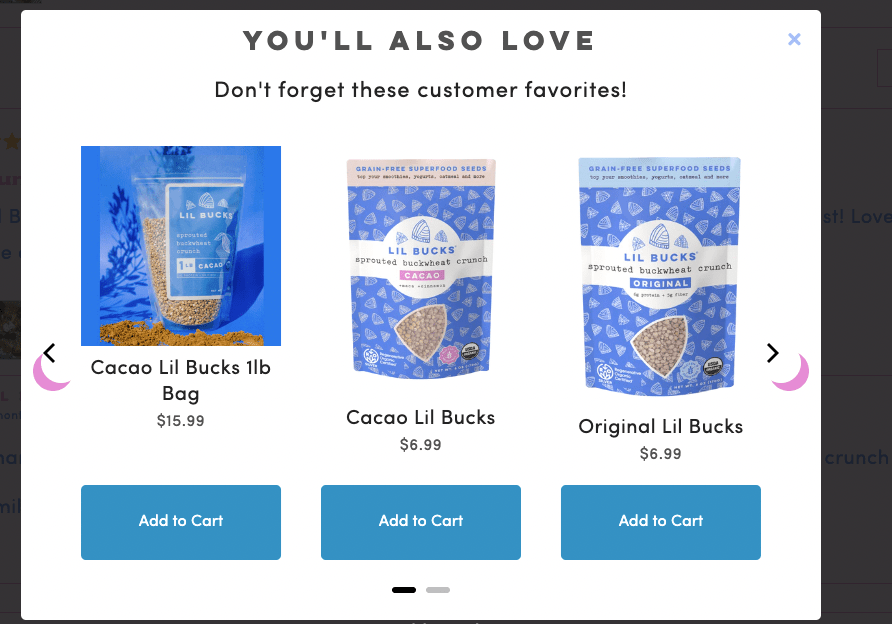
- Popups with products related to those the customer has in the shopping cart
- Time-limited deals for visitors on a specific product menu section
This popup box shows related products to the one that has been added to the cart.
Onsite marketing is personal
Onsite marketing helps sell more by turning more website visitors into customers. It's different from the usual methods because it brings together all the tools on a website (like popups, bars, signup forms, live chat, and more) into one cohesive plan. When you use onsite marketing, you can make shopping on websites more personal for each visitor.
Oleksii Kovalenko is the head of content at Wisepops. He has been working in ecommerce marketing for over six years, helping online stores generate quality leads and grow. Besides marketing, Oleksii studies climate science and enjoys watching NFL games.


