When it comes to customer loyalty, there are countless resources that discuss the different ways you can build lasting relationships with your customers. Typically these conversations revolve around the products and services your brand offers, listing rewards, service, and support as three of the most effective ways to encourage customers to return.
These methods emphasize verbal communication and deliberate actions, so their success can be easily measured through conversations with employees and customers alike. However, not all impacts can be heard. For some brand elements, seeing is believing.
While many people might argue that you shouldn’t judge a book (or brand) by it’s cover, the reality is that many customers often do. In fact, up to 90% of all impromptu purchase decisions are made based on what a brand looks like. From the logos you use to the layout you choose, customers are forming opinions of your brand based on what they see, and what’s at the root of each of these elements? Color.
The Importance of Color
One of the earliest questions I can remember being asked is “what is your favorite color?” Although my answer has changed over the years, the fact that people are curious about my color preferences has not, and understandably so. We’re fascinated with color because it’s able to convey emotions, messages and ideas – all without saying a word.

This means color has the tendency to affect how we perceive things around us, based on our previous experiences and preference. Grey and cerulean blue, for example, will always remind me of the joy I felt the first time I saw Cinderella’s Castle at the end of the Main Street, U.S.A. in the Magic Kingdom.
Although color can remind us of positive experiences, they can dredge up very negative memories, as well. My dad is still very adverse to metallic orange, as it immediately reminds him of being in the hospital and drinking cans of Orange Crush after breaking his arm as a child. Whether it’s rational or not, that experience has prompted him to avoid anything else in that color, which is representative of a new set of color concerns today’s brands are facing.

With so many emotional ties and memories attached, colors can generate a series of preconceived ideas that, from a marketing standpoint, can be difficult to overcome. Even your store’s ideal customer can be hard to attract if your brand is designed using colors they hate. On the same token, this preference bias could be the difference between earning a customer’s loyalty for life or sending them to a competitor.
The 5 Dimensions of Color Psychology
So what can you do to avoid negative color associations? Unfortunately, it would be impossible to completely avoid every single customer’s poor impressions of a specific color – there are simply too many variables at play for that. However, while there’s no hard-coded formula for choosing colors for your store, understanding how they’re perceived will help you determine what direction to go with your brand.

This perception is what determines a color’s “appropriateness” for your brand. For customers, this is the most important consideration as the colors you choose frame how they interpret your brand’s personality and how it differs from your competitors.
Jennifer Aaker explored this relationship thoroughly in a research paper she titled “Dimensions of Brand Personality”. As a psychologist, Aaker was fascinated by this concept of “appropriateness” and wanted to explore what that meant in relation to a brand’s products. Through her research, she determined that there are 5 distinct categories that play a role in determining a brand’s personality:
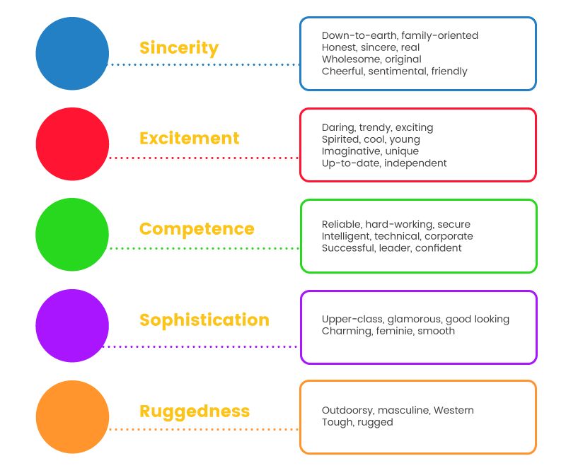
Aaker associated each of these categories with a specific color based on pre-existing theories and studies. These studies included lists of words and emotions linked to each color. Through her research, she was able to determine that in spite of pre-existing trait associations, a color’s feeling and mood is more important to its appropriateness for any given brand.
In simpler terms, Aaker’s research revealed that the best way to appeal to your customers is simply by aligning your brand’s personality to a color that feels authentic.
Applying Color Dimensions to Customer Loyalty
Although you may find this information intriguing, you’re probably wondering how this all relates to customer loyalty. If we’re to take Aaker’s advice, the key is to design a brand that looks and feels like your ideal customer. By doing so, you will be able to attract customers who share your values and begin building relationships that grow from browsing, to buying, to repeat purchases.

It shouldn’t come as a surprise that we believe the easiest way to facilitate this color/loyalty relationship is with a rewards program. Rewards programs are a widely-recognized strategy for incentivizing and engaging with customers. In addition, running a rewards program gives you the chance to build an integrated brand experience that further highlights your brand’s unique voice.
While there are many brands that do this exceptionally well, I’ve pulled couple of my personal favourites to illustrate this principle at work.

As a cosmetics brand, Spectrum needed to make sure they stood out in the overwhelmingly crowded industry. So where other brands opt for more classic feminine shades like soft pinks and pastel mint, Spectrum opted for a bold and bright purple as the backbone of their brand. No matter where you look, Spectrum’s store is bursting with life and energy. From custom fonts to dynamic product photography, they keep your eye moving and give you multiple opportunities to explore what makes their brand unique.
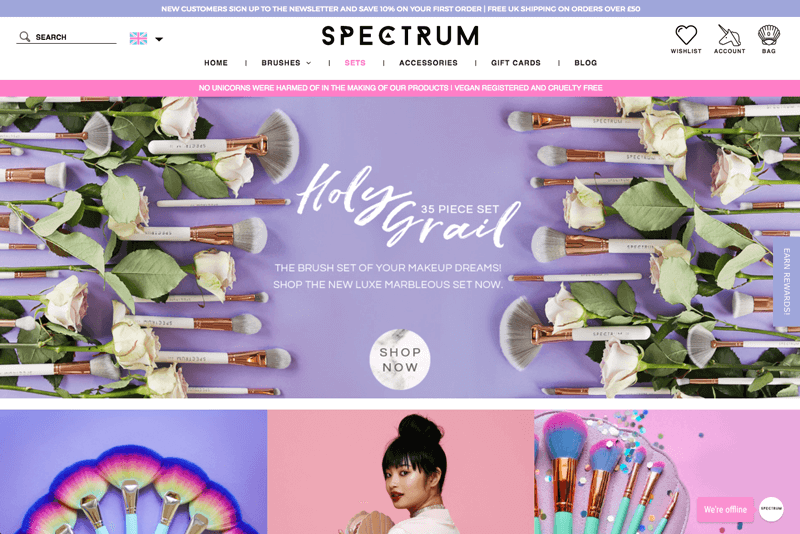
Besides being eye-catching, Spectrum’s choice of purple was inspired for several other reasons. For one thing, purple has often been associated with royalty. Hundreds of years ago, purple dye could only be made using expensive mollusk shells which only kings could afford. This allusion invokes ideas of luxury, as well, appealing to customers who are looking to treat themselves to first class beauty products.
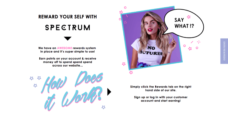
Finally, purple is the color of imagination and creativity. This pairs perfectly with Spectrum’s use of unicorn and mermaid imagery. These fantastical creatures transport shoppers to another world, filled with endless possibilities and exciting stories – perfect for a brand that advertises that “no unicorns were harmed in the making of our products”.
Each of these elements – combined with purple’s perceived femininity – work together to build a brand that young, forward-thinking beauty artists can’t wait to engage with.


When it comes to their health and fitness, customers aren’t willing to take chances. They want to shop with brands that they know they can trust to help them reach (and maintain) their goals. In order to position themselves as an authoritative brand, Muscle & Strength focused on building a persona that reflects the change their customers want to see in themselves.

Although their photography played a huge role in this process, the use of the color blue was also extremely impactful. As possibly the most popular color on earth, blue is widely regarded as confident, professional, and trustworthy. These three adjectives perfectly describe the image Muscle & Strength presents to their customers, and are especially important in an industry with such high competition.

Above all, however, blue is known as the color of strength. More than anything else, Muscle & Strength wants to establish themselves as a professional industry leader in the fitness world. With so many people advertising themselves as health and fitness experts on platforms like Instagram, YouTube, and Twitter, Muscle & Strength projects an aura of professionalism and knowledge that will appeal to those looking to take their health seriously.


While Nintendo is no stranger to any color, the success of the Super Mario franchise has firmly solidified red as their predominant shade. As a kid there were few things as exciting as seeing that iconic red ball cap materialize on-screen, and I knew that the next couple of hours would be filled with fun and adventure.
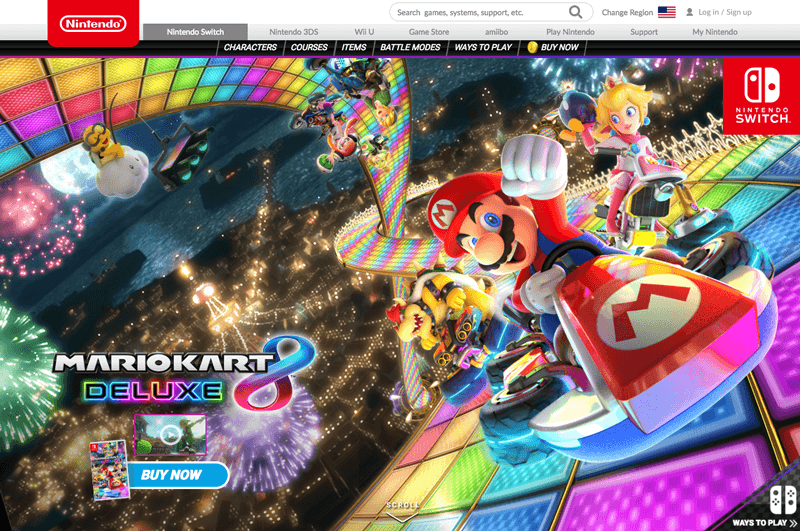
This is the power of the color red. For centuries, red has been associated with ideas of passion, life, and energy. For a video game company looking to inspire their users to play in worlds of fantasy, this is the absolute jackpot. Renowned for their fantastical storylines and engaging characters, Nintendo is looking to position themselves as a brand that can transport its customers to other dimensions.

This sense of movement is built into the bold, striking nature of the color red. No other color comes close to packing the same punch, and the excitement it invokes often creates a sense of urgency. Each of these principles are evident in their My Nintendo program, which uses flat bold expanses of color to draw customers in and inspire interaction.
Nintendo is a brand unlike anything the world has seen before, making red the perfect vehicle for promoting their forward-thinking design and products. It’s hard to walk away from such a rich, deep color, and Nintendo uses this to their advantage as they look to inspire loyal customers.


Between work, family, and every other responsibility in between, customers lead extremely busy lives. This can make healthy eating a difficult practice to maintain, and where Vegetable and Butcher comes in. With a passion for healthy eating and sustainability, Vegetable and Butcher delivers nutritious meals directly to your door in order to help you “look, feel and perform your best”.
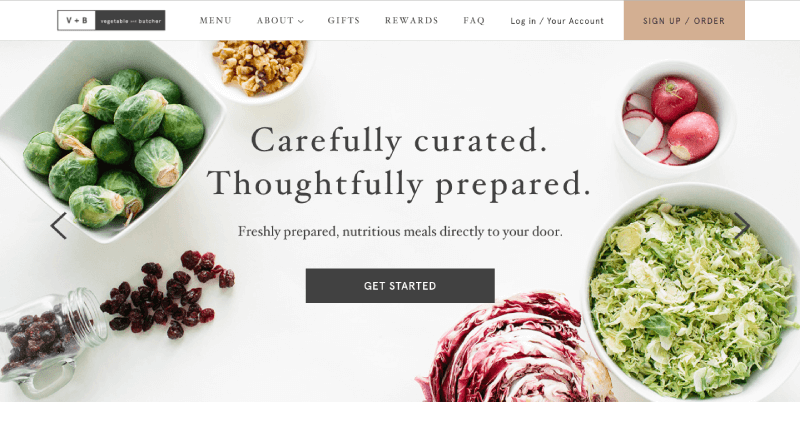
As a food and beverage company, it shouldn’t come as a surprise that Vegetable and Butcher have chosen the color green to drive their branding. With heavy associations to between it and the environment, green is seen as a healthy and safe color, prompting images of growth and longevity.
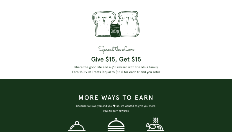
Additionally, green has been known to stimulate harmony between the body and brain. This relationship is perfect for a brand looking to connect people with a healthier lifestyle – the brain makes the decisions that will better the body. This motive, combined with the soothing, natural feel of earth tones helps Vegetable and Butcher build a brand that attracts like-minded individuals who want to commit to their health (and repeat purchases in the process).


Many people are resistant to the idea of getting older. This has led to a notable boom in the beauty industry as brands try to get ahead of the clock to help their customers preserve their youthful skin. StriVectin is an excellent example, as they challenge their customers to “outsmart aging” with their variety of hair and skin products.
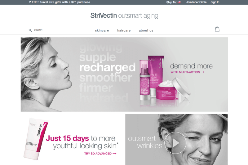
But why would customers choose StriVectin over the multitude of other options? Simple: because they understand how to market themselves. With a predominantly monochrome palette, StriVectin has rooted their brand in a sense of timelessness and cleanliness. As a brand dedicated to preserving youth, this is a highly effective strategy.
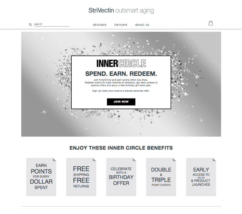
Black and white are also commonly equated with ideas of purity, cleanliness, and safety. These are extremely important considerations in the beauty industry, as customers with skin sensitivities need to be sure they’re going to be taken care of. StriVectin channels these ideas on their rewards page as well, where silver works to establish a sense of practicality that motivates customers to engage for their benefit.
With black, white, and silver, StriVectin has created a credible persona for their brand that encourages customers to trust them with repeat purchases.

The Long and Short of Color Psychology
As you can see, color psychology is more of an art than a science (pun fully intended). With so many different variables and extenuating circumstances, there’s no one answer for which color works best to inspire customer loyalty. However, it is abundantly clear that color is a powerful motivator and ally which, when understood, puts you in a better position to build loyalty and establish lasting relationships with your customers.


