Over the last week or so I have been encountering some pretty bad ecommerce sites! The things I see range from “mildly annoying” to “I will never shop with you again.” My frustrations have been building up to the point where I decided to write this post, and explain what makes a bad ecommerce site.
These are pain points I see when shopping online, and trust me I am not alone. For every one person who complains about a problem on your site, there are 10 that silently left and won’t return. Here are my X biggest piss offs when shopping online.
Design Problems
I will start with what your shoppers see first, the design of your site. The design of your site is vital to establish your site as credible and of high quality. Every page is important, but none is more important than the homepage.
Here are three design problems that make your ecommerce site look terrible!
1. Page is Too Busy
There is no greater cause for me to bounce than a site that has an overly cluttered homepage. Do not try to cram as much information as you can on a single page. It is not providing more information to your shopper, it is providing information overload and they will not read it!
2. Terrible Graphics
I know not everyone can be an artist or graphic designer, but sometimes you have to ask yourself “what were they thinking?” If you are going to use images on your site please don’t put a colored background on top of another color.

Left = No Right = Yes
It is also very distracting when there moving images on your homepage. This distracts your shopper and has the same effect of a busy page. It is no longer the 1990’s please stop using animated images on your site.

3. Conflicting Colors
Some colors do not look good together! You should be aiming to use some form of calculated color combination whether it be complementary, analogous, or triadic. If you don’t know about color schemes I recommend reading “Basic Color Theory.”
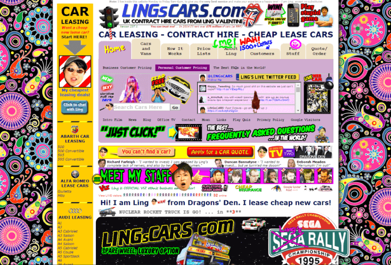
In summary you are trying to avoid your site from looking like this:

Be sure to give your sites design some thought. 46% of shoppers are assessing your store’s credibility based on the look of your homepage alone. If you want to see some examples of home pages done right, check out “30 Beautiful eCommerce Designs.” Design is only one component of what makes a bad ecommerce site.The site experience can also be terrible.
Experience Problems
I define an experience problem as anything that deters from me buying before I reach a product page. Most of these problems occur before I transition from the homepage to a second page.
4. Immediate Pop-Ups
If there is one thing that drives me crazy above all else, it is an immediate pop-up. These are the display boxes that come up and cover your screen immediately upon entering a site. In my opinion this leads to a bad ecommerce site.

How do I know I want to subscribe before I know what you sell?
How is a shopper supposed to know if they want to signup for your newsletter or get 30% off before they have even got a chance to see your site. Pop-ups have their place but they need to be done right! Set a delay on your pop-ups so that customers have a chance to digest what you sell before you ask for something.
If you want some tips on using pop-ups for ecommerce I would recommend “How to Use Pop-ups Without Annoying Your Customer.”
5. Proactive Chat
Live chat applications are fantastic, they allow you to solve customer complaints and answer questions in real time. They also are a fantastic customer retention tool! They are not meant to become a new form of pop-up.
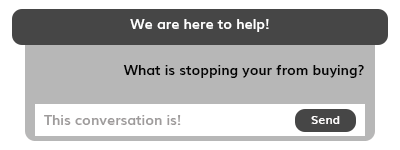
If you have a live chat solution don’t use it to initiate a conversation with a shopper. If they want to speak with you they will. As an example, I once was asked through chat “what is stopping you from buying that?”. I was looking at another open window and when I returned I left immediately.

Live chat should not be used to pressure customers
Live chat is meant to help your customers when they need you, not a tool to convince them to buy!
6. Registration to View the Site
This is even worse than an immediate pop-up! If you ask me to register to see what is on your site I am going to leave. Before I see your site you have shown me zero value and I am not about to give you my information for nothing.
The only way someone will register before seeing your site is if they are referred to your site by a friend or other trustworthy publication. If you want to make a site that is based on exclusivity you can use this tactic, but it almost certainly will kill organic sales.
These experiential flaws drive potential sales away before they even get to fully understand what you sell or what you can offer. That is why I think these problems lead to a bad ecommerce site.
Checkout Problems
Checkout problems are the most annoying for me, some of these really send me over the edge. The reason these problems are so infuriating is that they are not apparent until you are just about to make a purchase.
7. No Guest Checkout
You should always encourage a shopper to register for an account when they checkout, but you should never force it. Some people will only complete a purchase as a guest. A study by Smashing Magazine found that 30% of shoppers abandon their purchase when there is no guest checkout.

You should look to incent people to create an account instead of forcing it. I personally hate when a site makes me create an account.
8. Too Many Fields and Steps
A shopper has found exactly what they want and are now excited to make the purchase. The only thing standing between them and their new purchase is 6 steps and 26 fields to fill in. That is not an ideal situation for shoppers. Try to create as little friction at the checkout by only asking for required information and reducing the steps involved.
My Number One eCommerce Annoyance!
9. Shipping Information is Not Shown
This is my absolute biggest peeve when it comes to bad ecommerce sites, and most don’t realize it is a problem. Every site should explain the shipping costs somewhere a shopper can easily find it. Shipping is one of the most important things in an ecommerce purchase decision.
According to UPS 61% of cart abandonments are due to a shipping cost concern, and I couldn’t agree more. I hate selecting all the products I want only to find out that shipping will be more than the value of my cart.

A dedicated area on your site to answer shipping questions will reduce that abandonment rate and cut down on frustrated shoppers. You should also be sure to inform customers where you are able to ship to before the checkout page.
I am from Canada and the only thing more annoying than a huge shipping cost at checkout is not being able to get it shipped at all. If you are only shipping within the United States be sure to mention that before the checkout or you will have some very angry international shoppers.

JCPenny shows the value at which you will get free shipping.
Many companies are finding success offering free shipping thresholds to both inform customers of shipping costs and to increase a shoppers order value.
What Makes a Bad eCommerce Site?
There are many reasons that an ecommerce site can be classified as bad. The ones presented above are ones that really annoy me. Is there something in ecommerce that is really bugging you? Let me know about it on Twitter and we can look to get it on this list.


