Experimenting is a great way to improve your business - and we’re not talking about the exploding volcano experiments from your high school science fairs. One of the best forms of experimentation is A/B testing or split testing. Even if you’ve heard of this term you may be wondering “What is a split test?”, “What does ecommerce A/B testing look like?”, and probably most importantly “How do I run an A/B test?”.
We’ll cover all of these topics and more in this post so let’s dive right in.
What is A/B testing?
A/B testing, or split testing, is a tool that marketers use to test the performance of a certain variable with their audience. It’s a great way to get real-time insights and feedback from your audience.
“A/B testing, also known as split testing, is a marketing experiment wherein you split your audience to test a number of variations of a campaign and determine which performs better. In other words, you can show version A of a piece of marketing content to one half of your audience, and version B to another.” Hubspot
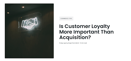
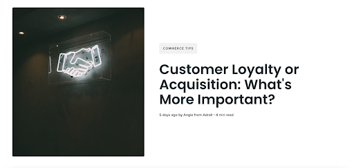
Let’s look at a very basic example - if we wanted to see which blog post title would lead to more visitors on this page we might test the 2 following titles:
- What is A/B Testing with Practical Ecommerce Examples
- A/B Testing for Ecommerce: A Beginner’s Guide
We would create two versions of this post, one with title A and one with title B, leaving the rest of the post completely the same. We would then set our test so that half our audience was exposed to the first version and half got the second version. We could then analyze which version got more reads, click-throughs on CTAs, and engagement. Then we would know which title to permanently leave on this post.
This is just one example, but there are hundreds of variables you can A/B test (but more on that later).
Why is A/B testing important?
We know what you’re thinking - why would I do twice the work and make two versions of my campaigns? I don’t have enough time as it is!
Here’s the thing - effective A/B testing can actually save you time and money in the long run. And the best part is, you don’t have to (and definitely shouldn’t) A/B test every part of your business. Effectively testing only the key elements of your business will help you to effectively spend less resources to gain more traction with your customers.
Some of the biggest benefits you can experience from strategic A/B testing are:
- Increased conversion rates and higher return on investment (ROI)
- Improved user experience (UX) through leveraging live customer feedback
- Reduced customer acquisition costs (CAC)
- Increased purchase frequency rate
- Reduced churn rate and cart abandonment rates
- Increased email open rate
- Allows data-driven decision making
- Can prevent expensive and time-consuming relaunch or redesign projects
Customer trends change daily so launching a website and logging off won’t cut it these days. Consistently testing and challenging your business’ standards helps to ensure you’re always set for success.
How to effectively run an A/B test?
Running an A/B test does not need to be complicated. Breaking it down into five key steps like A/B testing company VWO has done in their infographic makes it manageable for even the smallest of brands with limited time and resources. Let’s take a look at each step in more detail here.
A/B testing checklist
Step 1: Research
The first step in any good experiment is research, research, research. Studying your brand’s current performance is key to determining what elements you should be testing. You will want to analyze your current performance metrics and key performance indicators (KPIs).
This can include checking your website performance with tools like Google Analytics, your social media performance with Facebook or Instagram Analytics, or even your email marketing results with your preferred customer relationship management software like Hubspot or Mailchimp. No matter what metrics you are looking at, ensure that you are comparing them to your previously set goals.
There are also heatmap tools you can use on your website to determine where your customers are clicking on your site. This can help you determine where your customers are bouncing and how to keep them from bouncing in the future.

Step 2: Hypothesis/Goal formulation
Once you have a good idea of your current performance, you can determine where there could be gaps between your goals and your actual results. This is a great starting point to determine what gap you want to try to close.
Now that you have your consumer data, it’s time to make sense of it. For example, you can analyze why your bounce rate on a certain page is so high and then determine a hypothesis on how to improve it.
Be careful to choose only one variable for your A/B test when setting hypothesis parameters. Think about it - if you want to improve your email open rate and you test a variety of factors all at once including the subject line, the frequency of messages, and the time of day the message is sent then you will have a pretty tough time figuring out what was really driving any changes you see.
Determine the length of time you’ll be running the test, what audience you will be exposing the campaign to, and the breakdown of who will be in each audience group.
Ideally, you will want to randomly assign viewers to each group and keep a 50/50 breakdown in each. Once you’ve determined what you are testing and made your hypothesis on how it will affect your performance, it’s time to dive into the variable (B) design.
Step 3: Creating a variable (B) design
This is where creativity comes into play. Now that you’ve analyzed your customer data, identified a gap, and developed a hypothesis on how to improve your performance, it’s time to design your variable or “B” design. This is the secondary design you will be showing to half of your audience to compare to your original design.
This will likely include changing small details to your original design such as changing a CTA button color, product description copy, or your logo. Create this secondary design and then get ready to see how it performs.
Step 4: Run A/B test
Once you’ve determined what to test and designed the variant, it’s time to actually run your A/B test. The timing and duration of your test are key here - if your test is too short then you may not gain meaningful results.
“Calculate the test duration keeping in mind your average daily and monthly visitors, estimated existing conversion rate, minimum improvement in conversion you expect, number of variations (including control), percentage of visitors included in the test.” VMO
You can use free tools like VMO’s A/B Split & Multivariate Test Duration Calculator to make this step a little bit easier. Once this step is over, you’re almost done and you’ll have useful data to make informed decisions to improve your ecommerce brand’s success.
Step 5: Analyze results and draw conclusions
Now it’s time to put your hard work into action to improve results. First, analyze the results of your test against the goals and hypothesis you formed in Step 2. You can see which variant performed best and implement it for good.
The key to successful A/B testing is to continue iterating, measuring, and repeating this process. By continuing this process over and over again you can continuously optimize your website, social media, and email marketing strategies.

9 practical A/B testing ecommerce examples
1. Calls to Action (CTAs) - Try changing different variables like the copy, color, position on page, or size of your CTA buttons to increase click-throughs and conversions.



2. Emails - If your email open rates aren’t up to your standards, test out various subject lines, play around with the frequency of emails, or test the CTAs in your emails.
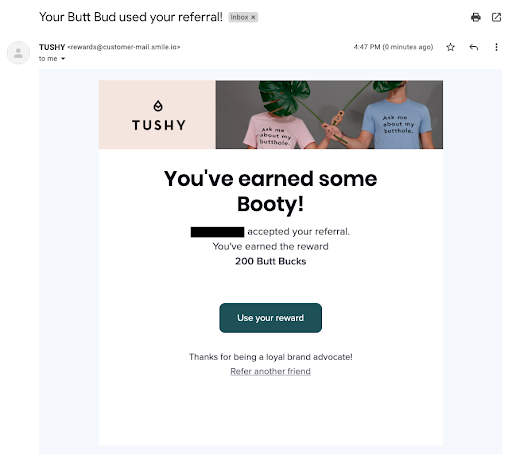
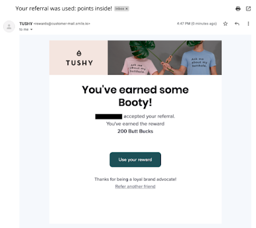
3. Ads - One common A/B test is to test two versions of an advertisement to see which has a higher click-through rate. This can include your social media and search ads and you can play around with the copy, imagery, type of ad, offer, or CTA.


4. Title Copy - Titles are important - they catch the reader’s interest and can make the difference between clicking on a page or not. Test out different titles on your web pages or blog posts.
5. Product Pages - As an ecommerce brand, this is a big one to increase purchase conversions. Test out your page layout, product photos, description text, and review format on your product pages.
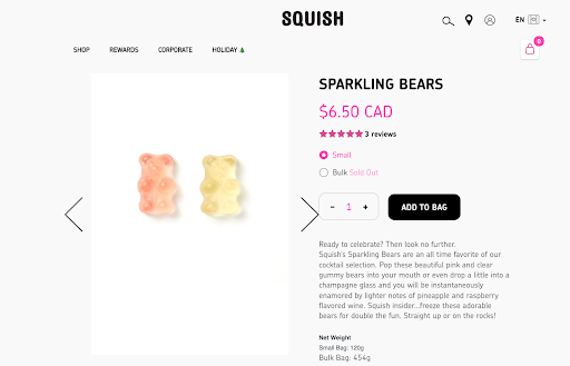
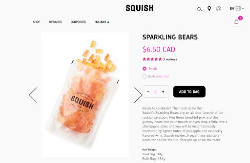
6. Pricing and Promotions - You also might want to test out your actual prices if sales aren’t at the level you’d like. You can play around with different promotion offerings such as offering higher product prices with free shipping to one group compared to lower product prices with separate shipping charges to the second group. You can test this to see which generates a higher average order value (AOV).
7. Personalization - This is a big trend in ecommerce that customers are expecting now. Test personalization factors such as ‘Products You May Like Sections’, cart abandonment emails, thank you emails, or loyalty program features like points reminder emails. You can even take this one off-screen and see if personal touches like hand-written thank you notes or custom packaging affect customer satisfaction at all.
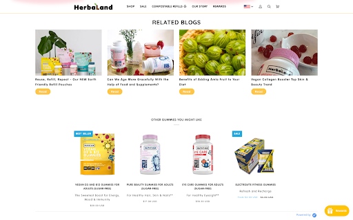

8. Landing Pages - Similar to product pages, you want your landing pages to convert! Try different page designs, CTA copy, colors, the use of pop-up notifications, or the amount of text to see what improves conversion rates.

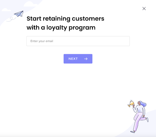
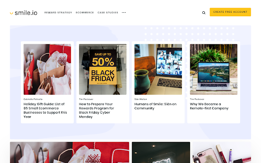
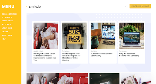
9. Menus - Menus are essential for ensuring a seamless customer experience. Test out dropdown menus vs. horizontal navigation bars on the top, or the actual pages included in your menus to see what improves your user experience.
Stop guessing, start testing
If you’ve been wondering how well all the pieces of your ecommerce business strategy are performing, A/B testing might be exactly what you’ve been looking for. It’s time to stop guessing and start growing your brand. If you’re not sure where to start, check out some great online A/B testing tools that make running these tests as easy as can be - some of them are even free!
A/B testing doesn’t need to be complicated, use these tips and tricks to make it as easy as AB(C)!


