

When you’re designing an ecommerce loyalty program, there are many things you need to consider. Things like your program’s name, currency, and spending rules can all help convince customers to join, but none of this matters if they don’t understand how your program works.
That’s where an explainer page comes in. Having an explainer page is one of the easiest ways to drive loyalty program engagement and participation because it helps customers understand how your ecommerce loyalty program works. More importantly, it tells them how they’ll benefit by joining.
In general, an effective explainer page should:
- Excite customers about the program’s benefits
- Explain how the program works, and how to participate
- Convince the customer to participate
Based on this criteria, we've put together a list of 10 of our favorite explainer pages for ecommerce loyalty programs. Let’s see what ecommerce loyalty excellence looks like!
Seek Collective’s Seek Rewards
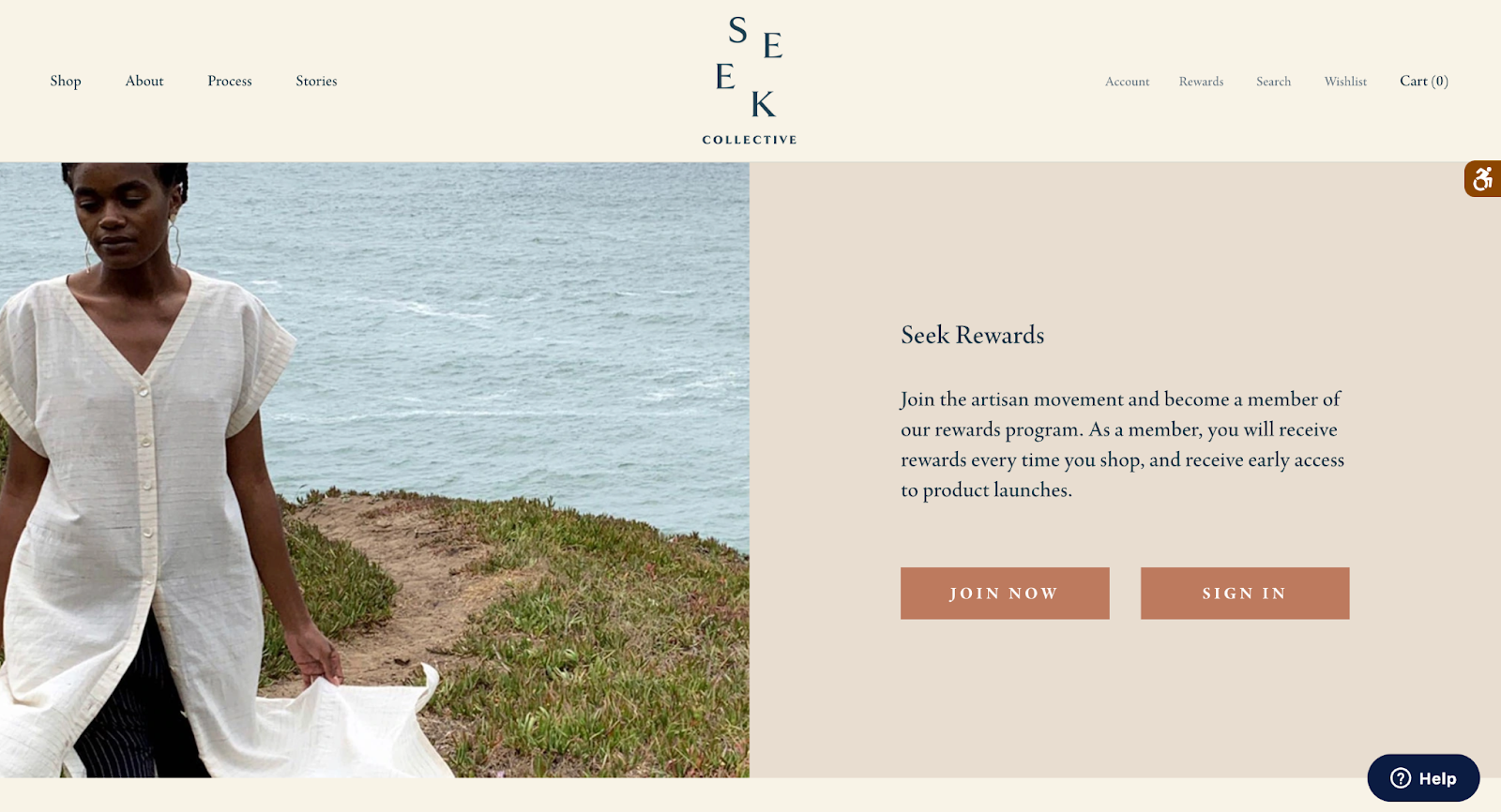
When we stumbled upon this explainer page, we immediately fell in love with it. Not only is it minimalistic and simple, matching their brand values, but it also immediately explains what the program is all about in a few short, to-the-point sentences.

By letting their icons do most of the talking, Seek Collective was able to keep their explainer page clutter-free and easy to scroll through. With less words and fewer distractions, customers are able to easily understand the program and absorb more information faster, making it highly effective.
The Takeaway:
Less is more! Use a combination of icons, images, screenshots, and simplistic, on-brand design instead of text to make your program’s information easier to digest.
Ballsy’s Ballcoin

Ballsy definitely lives up to their name with some pretty tongue-in-cheek text on their website that effectively and simply explains their products: “men’s grooming products for man parts.” They applied this simple, straightforward approach to their Ballcoin rewards program as well, designing an explainer page that doesn’t waste any time. Within seconds, customers are told how to earn and spend rewards with bold and cheeky text that definitely catches your attention.
To really hammer it home, the vibrant blue and bold text on their VIB explainer graphic really pops out against the white background, drawing the customer’s eyes to the important information. The fun copy definitely helps–after all, who wouldn’t want to be a VIB and earn “Mad Respect”?
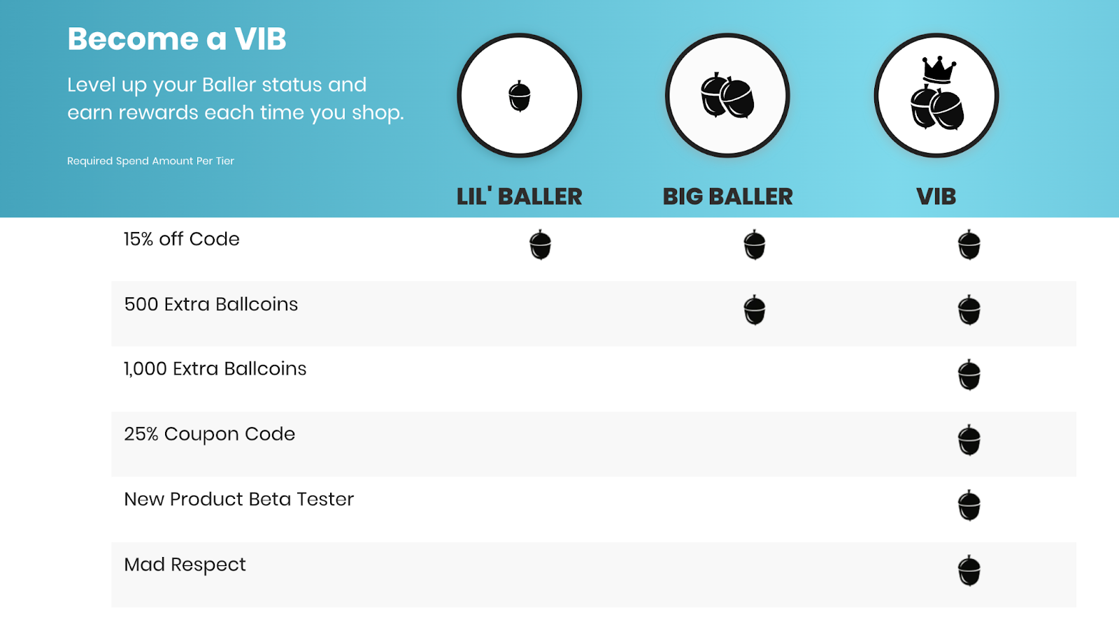
Aside from these two elements, the rest of their explainer page is just as great. Simple, on-brand text describes how the referral program works, and colorful icons explain how to earn and redeem ballcoins. This design method ensures that the page will pass the “blink test”, giving customers only the information they need in order to decide whether they want to join or not.
When a program’s this simple (and looks this good), why wouldn’t you join?
The Takeaway:
Simplicity is key! Design your explainer page around your program’s most important information and be mindful of what information is going to stand out in that initial 3 to 5 second glance. And don’t be afraid to be bold!
Muscle & Strength’s M&S Rewards
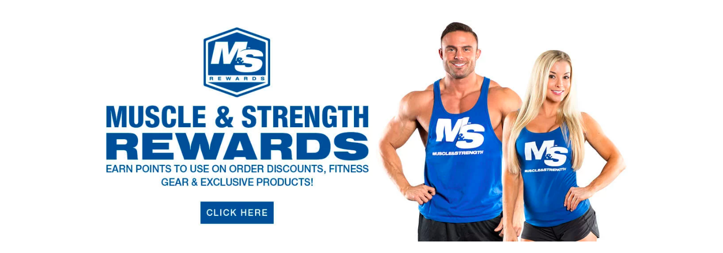
When you sell products online, people want to see pictures of each item so that they know what they’re getting. The same can be said for the rewards in an ecommerce loyalty program. People join programs for the rewards, and while points and dollars off can be motivating, free products help showcase a program’s tangible value.

Muscle & Strength rewards program members with products their customers know and love. Through both their informative explainer page and a separate Rewards Catalog, customers can browse all of the available rewards and get an idea of what they’d like to earn. Including these promotional or best-selling product rewards on your explainer page helps make the end goal real for your customers, encouraging them to spend more to get more.
The Takeaway:
If they see it, they’ll believe it! Show customers real products to help make the value of participating in your program more tangible.
Blume’s Blumetopia

Readability is one of the most important features of any explainer page. If you have paragraphs of text, chances are customers will assume your program is complicated and will choose not to join based on that first impression. This means it’s critical to answer key questions quickly: how your program works, how shoppers earn and redeem rewards, and how to sign up.
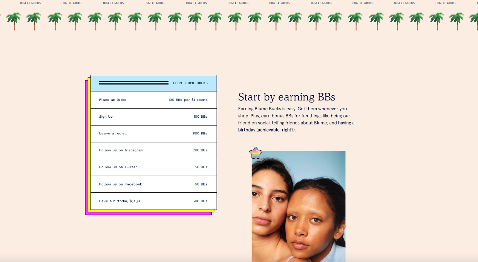
Blume’s explainer page hits the nail on the head. Right off the bat, customers are shown how the program works with short snippets of text accompanied by custom fonts and graphics, as well as branded photography. Each one of these features are both informative and on brand, eliminating the need for customers to visit a separate FAQ section.

You really need to see the whole page to truly appreciate it’s design, but this is undoubtedly one of the best ecommerce loyalty explainer pages out there!
The Takeaway:
A picture’s worth 1000 words. Make your ecommerce loyalty explainer page very visual with branded texts and images that get straight to the point.
 Kirsten Burkard
One Love Organics’ Love Club

Imagine you’re a new customer visiting your site for the first time. Are they going to be able to find your loyalty program? If the answer’s no, you’ll definitely want to take a look at One Love Organic’s loyalty page – or rather, their program launcher.
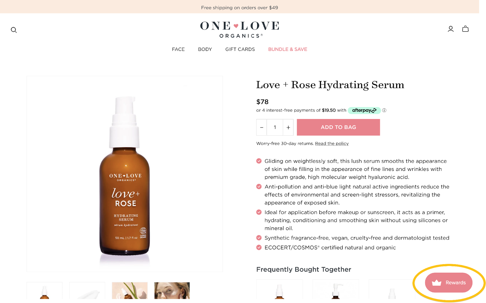
Unlike the other programs we’ve looked at so far, One Love Organic has both a beautifully designed explainer page and a program panel. The panel can be accessed on any page of their site by clicking their “Rewards” launcher. From there, customers are told that they can earn and spend points for rewards and are invited to create an account.
One Love Organics understands that visibility is the number one way to encourage customers to join an ecommerce loyalty program, and has made sure that every single customer can find their loyalty program no matter where they are on the site.
The Takeaway:
Make it visible! Whether you use a link in your navigation bar or a rewards launcher like One Love Organics to advertise your explainer page, getting it in front of people is the best way to get them to see it.
Buttercloth VIP Rewards
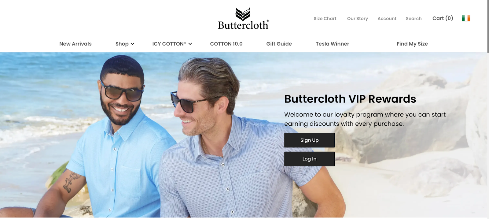
There are two reasons a customer visits an explainer page: to find out more about the program or to sign up. This makes it extremely important to design an explainer page that gives customers clear instructions on how to do that.
Buttercloth raises the bar by giving customers the opportunity to join as soon as they land on their VIP Rewards explainer page. This makes their call to action highly visible without cluttering the rest of their explainer page.

Customers are also invited to join at the bottom of the page with an equally bold call-to-action. Here, they even go one step further by showing customers what they’re working towards with their different reward levels. This type of design appeals to both motivations for visiting an explainer page and results in a higher enrolment rate, making it highly effective.
The Takeaway:
Provide a clear call to action! If your customers aren’t told to enroll, chances are they won’t. Make participation with clear instructions and an easy-to-access enrolment form.
Marvel’s Marvel Insider
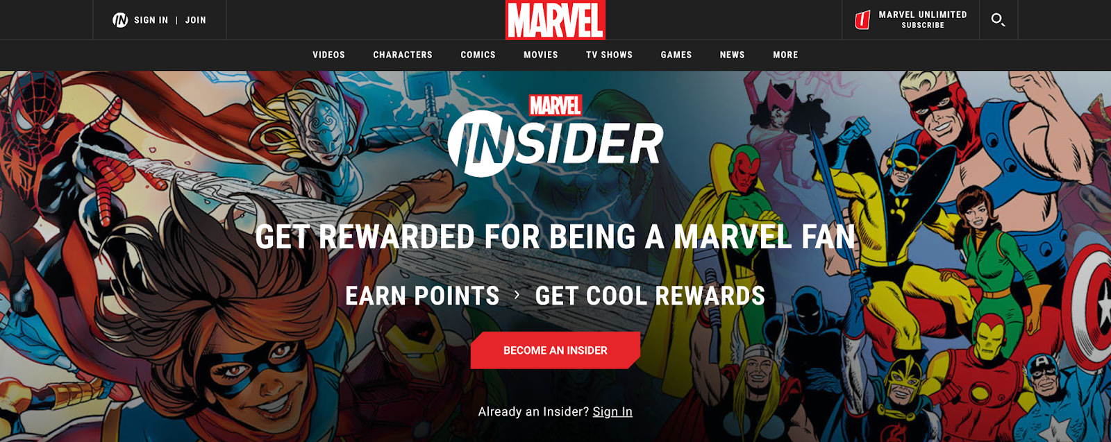
If you’re a hardcore Marvel fan, you may already be aware of their loyalty program: Marvel Insider. While we would have been interested no matter what the page looked like, they have done an exceptional job of using their explainer page to highlight the benefits of joining their program.
For one thing, customers are immediately promised “cool rewards” as soon as they land on the page. If they left it at that, this might be vague and unmotivating, but Marvel immediately follows it up with their cool rewards such as one-of-a-kind Marvel experiences, exclusive Insider-only Marvel merch giveaways, and digital comics, wallpapers, and in-game rewards.

However, the most notable benefit is social status. Marvel Insider rewards customers by dividing them into four progressively elite groups, and this program feature is strongly emphasized on their explainer page.
This is a genius move because VIP tiers are a loyalty feature that sets many successful programs apart. Advertising it heavily on their explainer page helps Marvel move their program into an elite loyalty category that successful programs like Sephora’s VIB Rouge currently occupy. In this way, Marvel’s explainer page communicates both what customers stand to gain and what they have to lose by participating or not participating in the program.
The Takeaway:
Show off what makes you different! If you offer something that no one else does, highlight it to help shoppers see what makes your program special.
Kirsten Burkard
Goose & Gander’s G&G Rewards
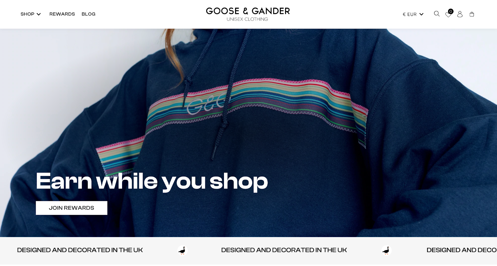
From the second you land on Goose & Gander’s rewards explainer page, you are invited to join the program with a clean and simple call-to-action. Throughout their entire page, customers can find aesthetically pleasing professional photography, keeping the brand at the center of everything they do.
Goose & Gander really understood the purpose of their page: inviting customers to join the program. For one thing, calls-to-action on top of beautiful photography are featured prominently at both the top and bottom of the page, sandwiching the more mundane program details with the eye-catching products customers actually care about.
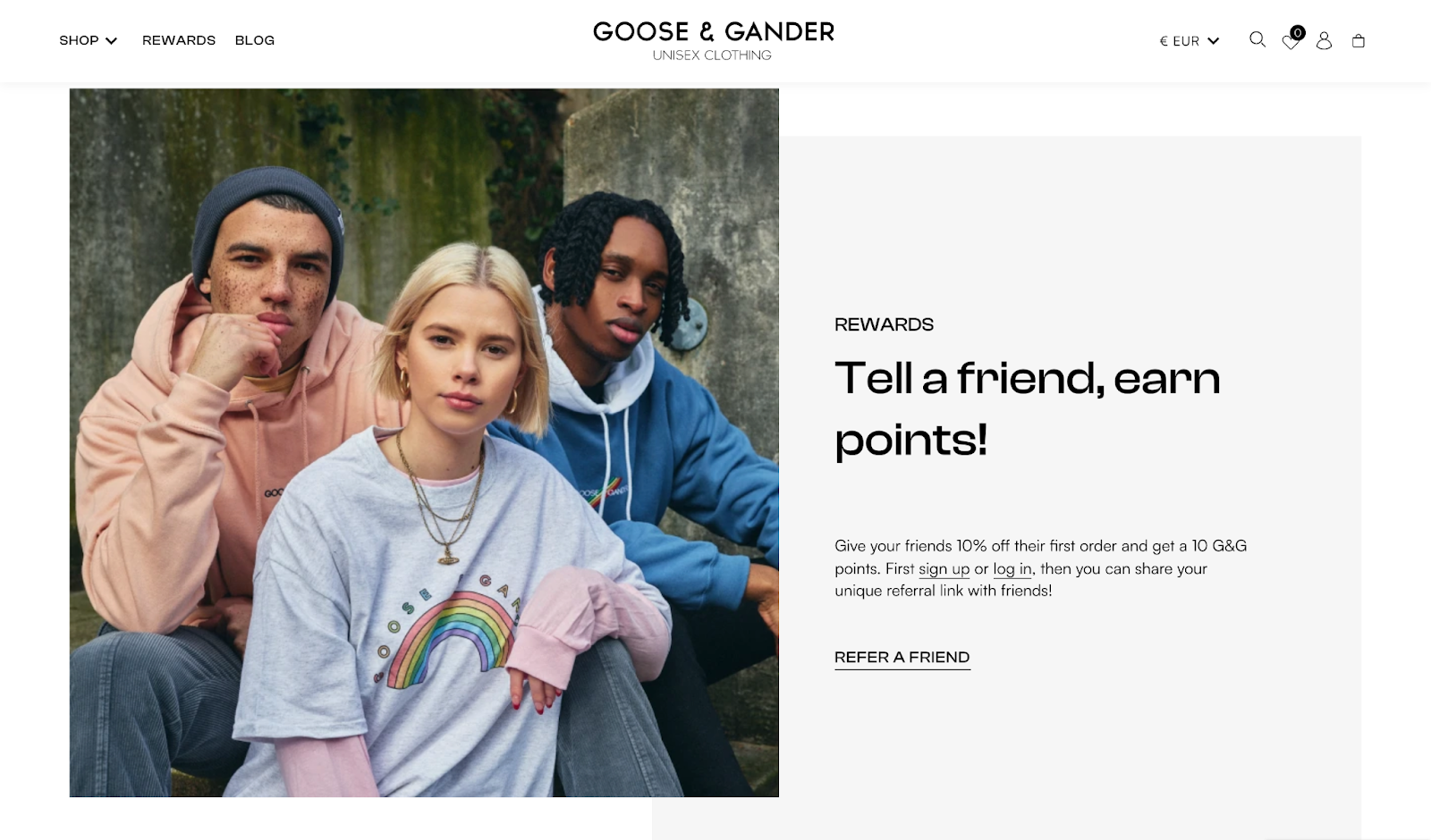
Goose & Gander took the opportunity to show off their products once again with their referral program explainer section. By showcasing a diverse group of people wearing their clothing, they are demonstrating their brand value of making fashionable, unisex clothing accessible for everyone. Program elements are accompanied by high quality photos that help illustrate the feel of Goose & Gander’s products and vibe, creating both a desire to participate and a desire to get involved with the fashion brand.
The Takeaway:
Show off your awesome products. Your customers are joining your loyalty program to work towards getting more of those products, so you might as well show them off.
Nintendo’s My Nintendo

Nintendo has built their success on characters and stories that draw people together. From Mario Party to Legend of Zelda, their brand is internationally known and inspires happy memories and positive responses from millions of customers worldwide. In other words, the Nintendo brand is built on emotions.
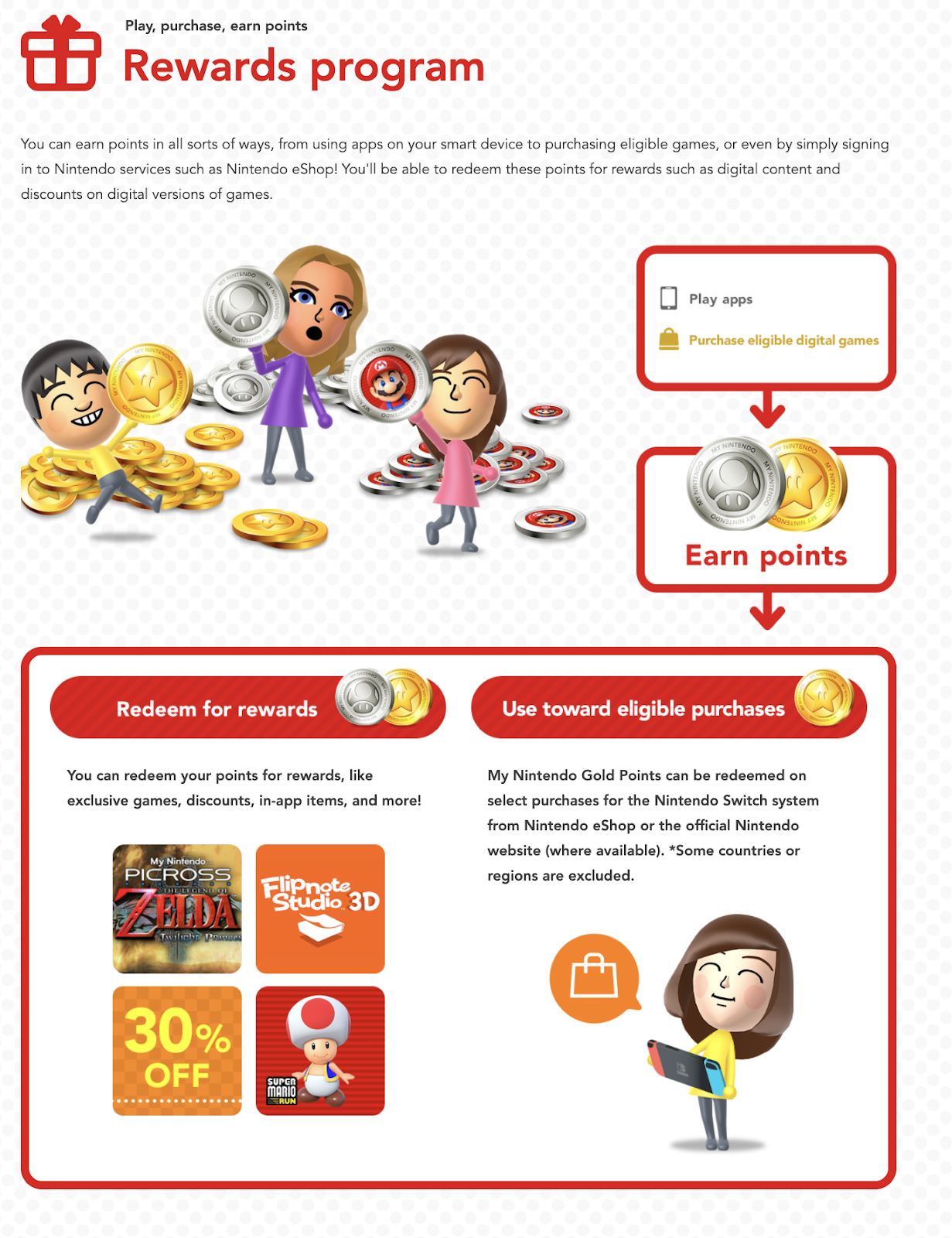
It makes sense, then, that their explainer page was designed with these emotions in mind. The My Nintendo explainer page is bright, colorful, and playful, with familiar characters explaining how to earn and redeem rewards. These elements immediately make customers happy, and lead them to equate that emotion with the My Nintendo program.
Nintendo’s explainer page demonstrates their keen understanding of emotions as powerful motivators. As much as customers want to be rewarded, they also want to have fun! So when an explainer page makes you feel this good, it’s very hard not to join.
The Takeaway:
Evoke an emotion! Customers respond to positive emotions and are looking for experiences that make them feel good. Color, fun characters, and familiar storylines will turn your explainer page into an engaging and informative loyalty tool.
Copper Cow Rewards

Customers want to participate in loyalty programs that not only benefit them but also fit into their life. Copper Cow Coffee has gone above and beyond to show customers how Copper Cow Rewards fit into their lifestyle.Specifically, subscription customers earn points every single month with their order. For coffee lovers, the caffeine can be enough to keep them coming back, but this sweetens the deal delivering a seamless rewards experience.

When you offer unique rewards beyond the typical discounts, your explainer page is the perfect place to show that to customers. Copper Cow Coffee uses product photography to demonstrate their various rewards from generous discounts, to subscription savings, and free coffee and creamers. Their “See Offers” calls-to-action feature brings customers right to their rewards panel where they can redeem these rewards in just a few clicks.
The Takeaway:
If you’ve got it, flaunt it! Your rewards explainer page should be specific to your brand. When you’ve got rewards customers couldn’t get anywhere else, promote them!
Get Inspired!
The ten programs mentioned here are by no means the only fantastic ecommerce loyalty explainer pages out there.
Whether you draw your inspiration from our list or elsewhere, there’s no doubt that a well-designed explainer page will serve you and your ecommerce loyalty program well. So what are you waiting for? Get out there and start designing! An explainer page could be the only thing separating you from your next best customer.


