Once you have implemented your loyalty program, the real work begins. Explaining how customers can earn and redeem rewards is important to the success of your loyalty program.
Loyalty programs are successful in getting users to shop and interact with merchants. According to BigCommerce, “50% of consumers said they increase their spending or change their purchasing behavior to get a higher tier status in a rewards program,” meaning shoppers are more incentivized to buy when a loyalty program is in place.
Customers want to know the benefits of signing up for a loyalty program. They want to see, “what’s in it for them”, before enrolling in your program and earning points.
They want to be sure that it is worth it. Customers are generally looking for 3 main components before signing up.
- What's in it for me?
- How do I earn points?
- Should I join?
3 Things potential members are looking for
Customer loyalty programs are important for you as a business owner because they accelerate growth and engagement. For customers–they are looking for a program that rewards them for their loyalty with meaningful perks. This could look like discounts, free items, or access to exclusive products and events. These are three questions that customers want answers to before they commit to joining your program.
1. What’s in it for me?
Loyalty and retention are the obvious reasons to start a loyalty program. You want to retain and have your customer keep coming back to shop with you. But shoppers aren’t going to be won over that easily. Building customer loyalty is a two-way street, and you need to give your customers something in return for their loyalty.
Your customers are asking, “what’s in it for me?” They will evaluate your program based on the benefits they can receive, not based on the benefit it provides you. Make it easy for your customers to understand the perks they are getting by signing up for your program.
2. How do I earn points?
Once customers establish what benefit a loyalty program is to them, the next question they will have is how to earn points? Customers also want to know how many points they will need for that specific reward, and what they have to do to earn those points. Basically, customers will be evaluating if your reward is worth the amount of effort they need to put in to get it.
Use plenty of visuals and simple text to make your rewards program easily understandable. The best way to do this is with an explainer page on your website. Brands use a mix of marketing strategies that include social media channels, email marketing, and even gamification methods.
3. Should I join?
The last question and evaluation a customer makes are asking if they should join the loyalty program. A great reward tier and the simplicity of earning rewards will push a customer over the edge and encourage a sign-up.
Use a visual explainer page to explain your program
Visual explainer pages work wonders in getting your loyalty program across to customers. Whether they are already shopping with you or just need an extra push, an explainer page can be the main hub where any site visitor can view your loyalty program details. Create a visual and simple explainer page that gives all the details (and the fine print).
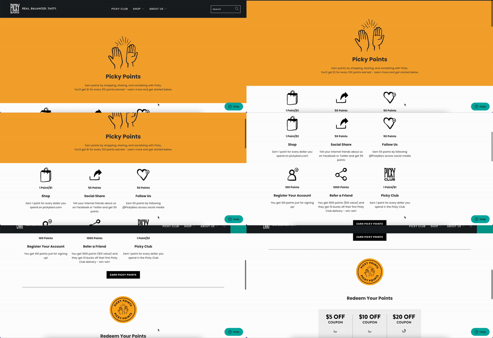
You can understand the basics of Picky Bars’ program in just a few seconds. You understand how to join, earn, and redeem rewards, just by scrolling through their page. Visually you can see the perks, in hopes of motivating you to join.
In general, an effective explainer page should:
- Excite customers about the program’s benefits.
- Explain how the program works, and how to participate.
- Convince the customer to participate.

Tips for a great explainer page
Creating a visual explainer page will supercharge loyalty program adoption and engagement. It allows everyone to know exactly what they can expect in your program, but some visual explainers are built better than others.
Here are a few tips with examples to make the most out of your loyalty program’s explainer page. These will put your explainer page in a class above the rest!
1. Showcase your motivator
Translation, showcase what appeals to your customer and what they want to see. Engage your members by motivating them to use your loyalty program. Show them what is possible by earning a reward. This could be a discount, a product, or even social status.
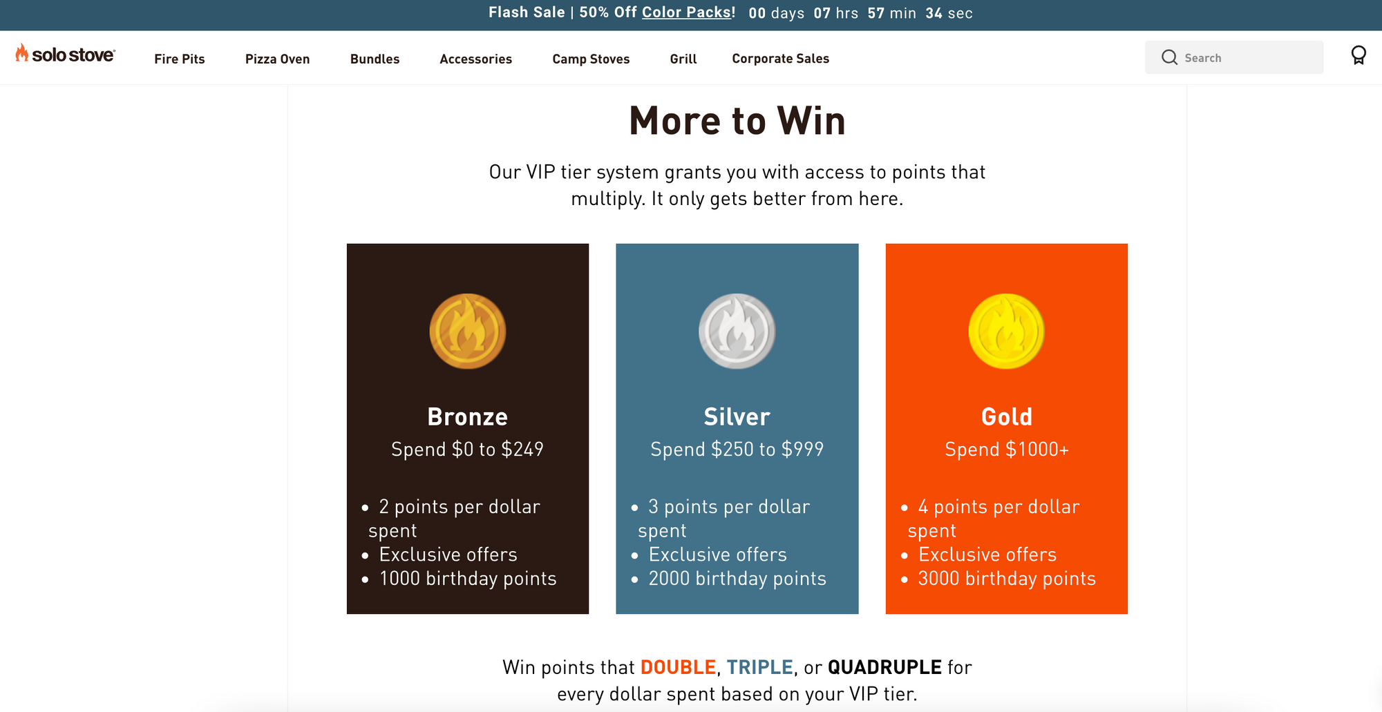
Solo Stove’s Firestarter Rewards page lays out what exactly customers can earn, shows their VIP tiers in a visually appealing way, and lays out its loyalty benefits. It shows a customer what’s possible to earn and gives off a social status for VIP members.
2. Make it easy to understand
A potential member of your program should be able to understand the basics of your program in just a few seconds. You do this by laying out your program in an easy-to-digest and visual way. We call this the squint test at Smile.io, can someone still understand your explainer page if they are squinting their eyes?
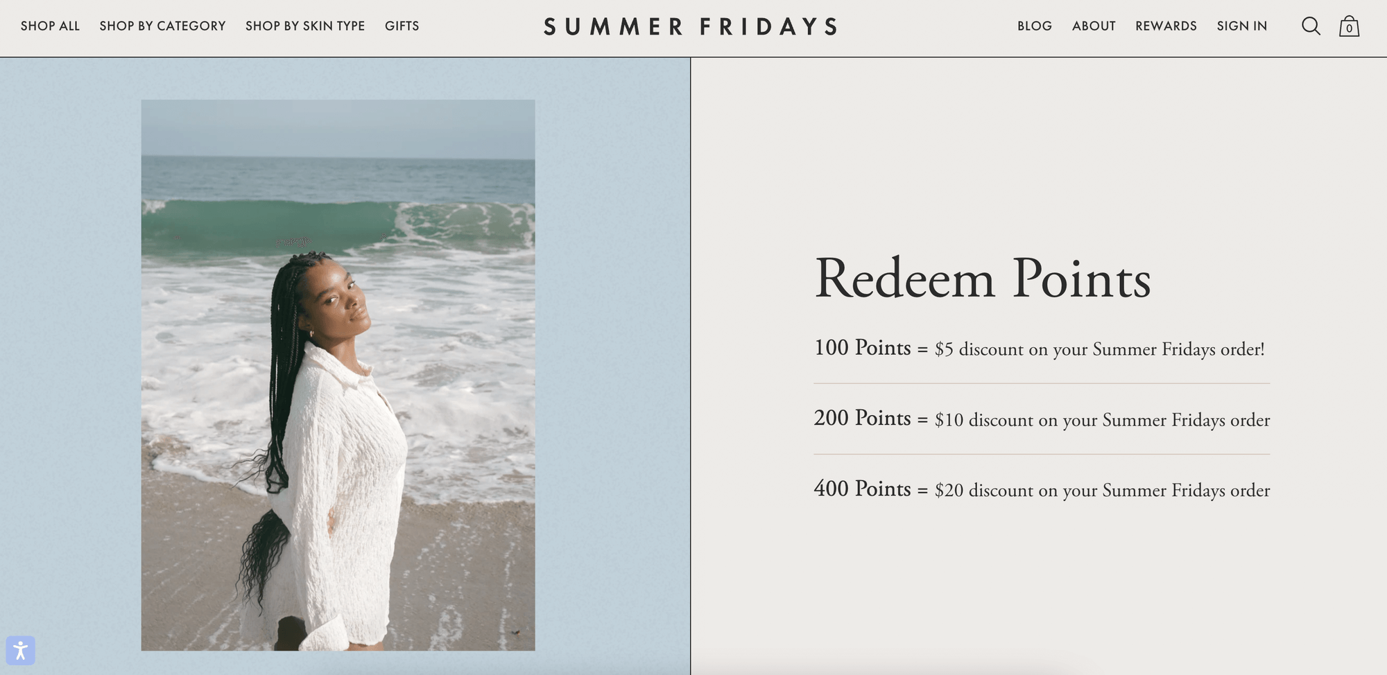
Summer Friday’s is a perfect example of this. Their loyalty program, Self Care Club, easily blocks each way to earn rewards. Their member benefits are shown on one page that covers the entire screen. It’s simple to read, simple to see, and simple to earn.
The text is large, the design is minimal, and it gets the point across. You clearly know that every 100 points gets you $5 off your order and so on. This section of Summer Friday’s program goes to show that less is more with an explainer page.
3. Have a clear call to action (CTA)
Your explainer page should be catering to two types of people. Those who are already members and want to learn more. But also to those who are evaluating if they want to enroll in your program or not. Your explainer page will be acting as a sales pitch, so you will want to make sure you end it off right.
This means that you should finish your explainer page with a very clear CTA. The CTA should instruct people to enroll in your program. Even if your explainer page does an amazing job showcasing your program, you still should encourage users to sign up. Make it blatantly obvious that you want someone to sign up, and show them exactly how to do so.
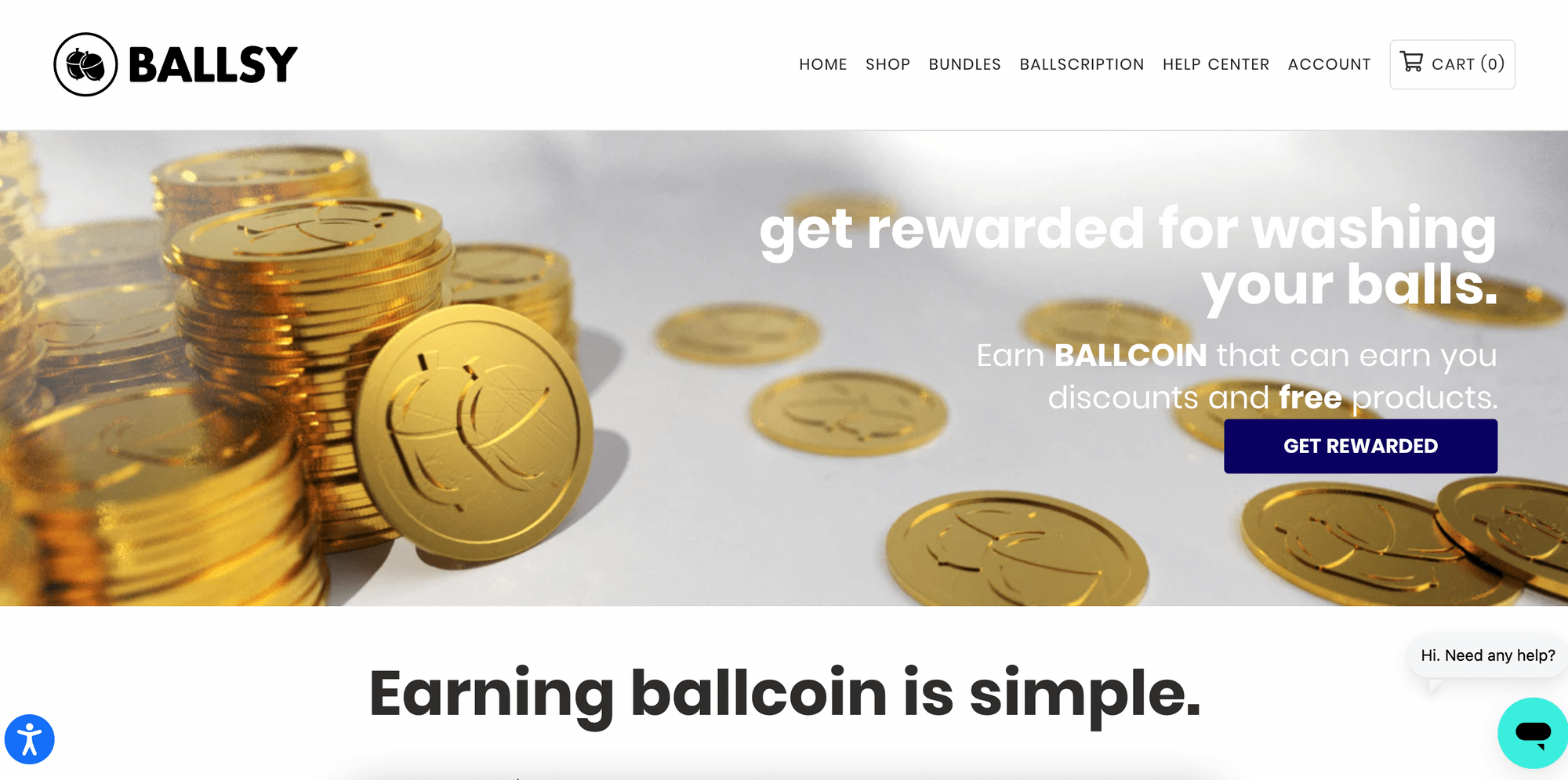
Ballsy, illustrates exactly where to sign up with a bold CTA, above the fold, the first content you see on the screen (where the browser window ends) before scrolling down. Any content that you need to scroll down is considered below the fold.
They tell you exactly what they want, which is for you to be rewarded and start earning discounts and other rewards.
4. Make your explainer page easy to find
You don’t want to leave your customers confused or with questions. Think of your explainer page as an additional way to not only explain your loyalty program but advertise it. Don’t make your explainer page difficult to find, or buried behind pages that your customers leave altogether. Or worse, don’t make your customers think you don’t offer a loyalty program at all.
Two strategies can be used to make your program easy to find. The first is to have it immediately visible upon landing on your site. This can be done by including it in your menu or some kind of banner, like Wild Poppies. The explainer page is located at the top right corner of their homepage, where it’s easily accessible to any site visitor.
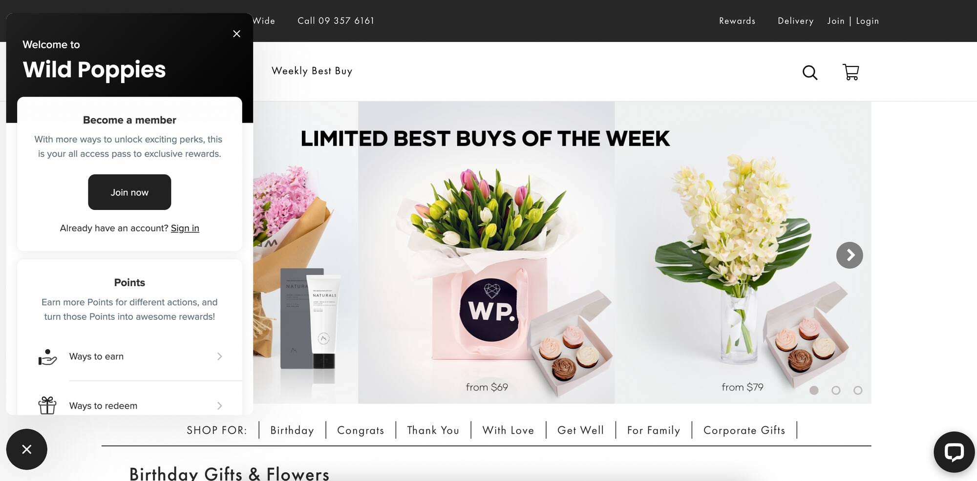
Another way to display your program on your homepage is with a loyalty program launcher. This is how Smile.io for Shopify, Wix, and BigCommerce works by default. Since it moves with the browser as you scroll down the page, it’s always in view. This is the easiest way to showcase you have a program, especially because it’s displayed on every page.
Lastly, you should add your explainer page to one of your menus. You can add it to your header menu or into a footer menu. This makes it easily accessible in an area that people go to to find information. The lesson here is that you should do everything you can to make your explainer page as accessible as possible.
Go build the perfect explainer page
There are so many other incredible ways to explain your loyalty program from email to social media, SMS and so many others. A good explainer page communicates to your site visitors and members. Follow these tips and tricks above for an explainer page that drives program sign-ups.
Check out our favorite loyalty explainer pages and grab some inspiration to build your own.


