
Starbucks is a staple coffee brand with more than 32,000 locations in over 80 countries around the world. It’s safe to say Starbucks has an abundance of loyal customers. The iconic brand has revolutionized the coffee industry and changed the way everyone consumes coffee. Starbucks took something that had been done the same way for decades and turned it upside down with effective partnerships, beautiful branding, and a variety of types of coffee drinks. They have been doing things differently ever since, including customer loyalty.
Starbucks Rewards is often regarded as one of the best retail loyalty programs in existence and one of the most engaged among its members. According to a CNN report, by October 2022, there were 28.7 million active Starbucks reward members. Giving Starbucks a 16% year-over-year growth in its loyalty program.
They have created a loyal following of customers both with their customer experience and revolutionary rewards program. But recent changes to its loyalty program have its members criticizing the new changes. It’s now going to cost more to earn that free drink and menu item, meaning customers will have to work harder to earn those stars.
Let’s dive into what makes Starbucks Rewards unique and what we can learn from its recent changes in loyalty.
Changes no one asked for
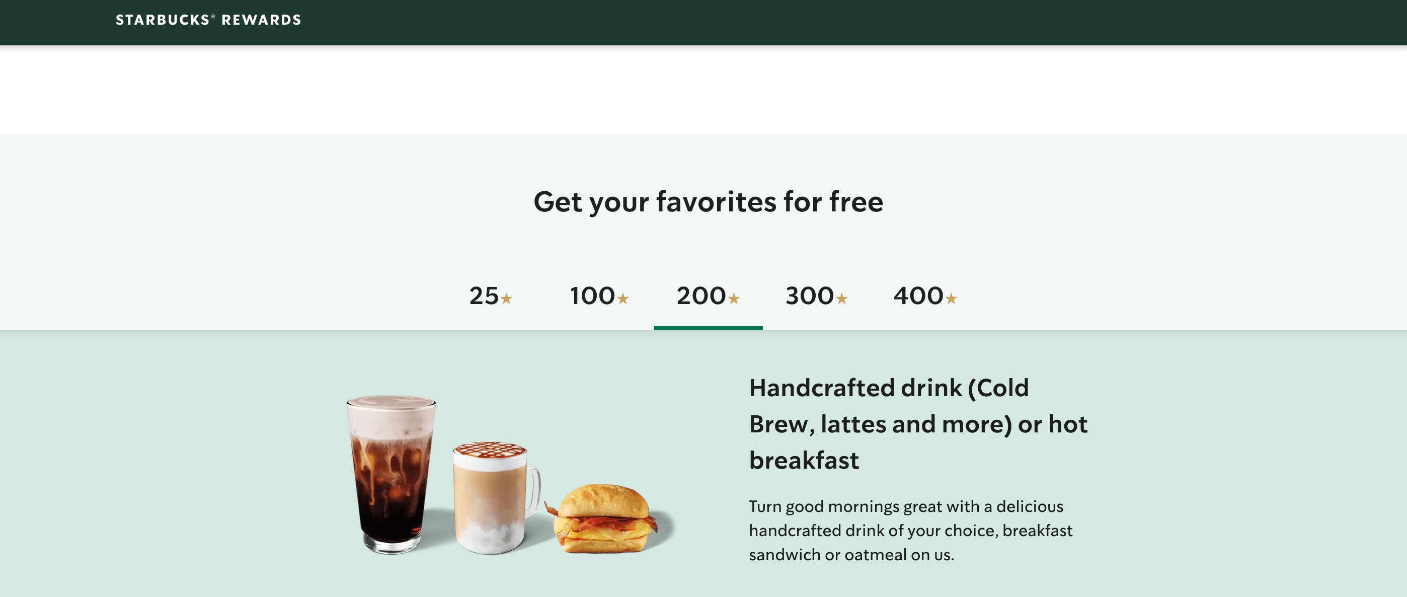
Starbucks Rewards has over 28.7 million active reward members and with new changes to its rewards program that went into effect last month in February, customers were not happy. Starbucks increased the amount of “stars” (loyalty points) customers will need to redeem items.
Here is the breakdown of what changed:
- What costs 50 stars increased to 100 stars.
- What costs 150 stars increased to 200 stars.
- What costs 200 stars increased to 300 stars.
- Hot coffee or tea, baked goods, and packaged snacks will be 100 stars, up from 50.
- Lattes, frappuccinos, parfaits, and hot breakfast items will be 200 stars, up from 150.
- Sandwiches, salads, and protein boxes are 300 stars, up from 200.
Currently, Starbucks reward members can earn 1 star per every dollar spent if members just pay with a credit, debit card, or cash in-store or pay in-app. Members can earn 2 stars per dollar if they preload money into their rewards account or register a gift card to pay with.
Idk if anybody told y’all BUT @Starbucks made their rewards about 50 stars more to redeem. It sucks a lot. What used to be 50 stars is now 100. Lol now I don’t even want to use them. 🥹
— AshCash ✌🏾 (@TechBaeAsh) February 16, 2023
With the recent changes, that free iced coffee or chocolate croissant will cost a bit more, $100 to be exact if you’re paying with cash or a debit card or $50 if you preload money in your account. To earn that free cold brew or a breakfast sandwich, you will have to spend $200 if you’re paying in cash or $100 if you preload your account.
The reason for the change is unclear if it's because of inflation or the rising cost of products everywhere. According to an Axios report, Starbucks said it was due to the changing needs of customers. “We occasionally need to make changes to ensure the long-term sustainability of the Starbucks Rewards program and to meet the changing needs of our members.” Members will disagree.
Starbucks really moved the reward levels back……..in this economy
— Jobe Bean Bryant (@jeauxdeci) February 27, 2023
How Starbucks Rewards misses the mark
Starbucks Rewards is one of the best examples of customer loyalty and how to build a brand community. Based on its recent changes and the reactions from customers, there are a few ways Starbucks Rewards misses the mark.
1. Changes no one wanted
Why change something when it’s not broken? Starbucks customers have tweeted, commented, and made dozens of TikTok videos on the unwanted changes Starbucks made to its reward program.
Customers were given a few weeks' notice of these changes, which left many to have to use all of their points before changes went into effect. Starbucks really missed the mark here because so many customers voiced their dissatisfaction with the recent changes and Starbucks did not relent and went ahead with their changes.
@maddykim16 #greenscreen starbucks is a scam!! #starbucks #stars ♬ original sound - Maddy Kim
2. Current tiers don't create exclusivity
Tiered programs are an amazing way to encourage customers to spend more and engage more. Tiers challenge customers to reach the next level while also introducing an element of gamification that customers love. Tiers are also effective when the highest tier is reserved for only the most loyal and profitable customer.
Starbucks currently has five tiers of different rewards customers can redeem. If Starbucks turned those five tiers into different levels of earnings, meaning each level would double the points earned, it would incentivize customers to spend more to enter and remain in a certain tier. Customers love an incentive or something to reach for and if Starbucks brought their famous gold card back, this would be a perfect way to entice customers into different tiers for their reward program.
How Starbucks Rewards raises the bar-ista
For a loyalty program contributing 55% of the company’s revenue, Starbucks has clearly locked in loyalty and a brand community. With an increase in prices in every industry, loyalty has become a key to growth and recession-proof for Starbucks. So what is Starbucks Rewards doing so well?
1. Outstanding mobile experience
Starbucks has become a global brand worth billions of dollars and we can take lessons on what great things they do in loyalty and rewards. Their top quality is their outstanding mobile experience.
How a customer interacts with a loyalty program can often make or break that program. Starbucks’ app makes its loyalty program more interactive and more effective. The app makes it easy to see how many “stars” (points) you currently have, as well as make orders and payments right from your phone. You can even use the service to find the nearest Starbucks location.
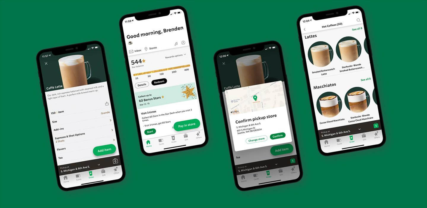
Starbucks mobile app, drive-thru, and deliveries generate over two-thirds of orders and up to 26% of sales from mobile apps alone. The app gives Starbucks Rewards an edge that other standard loyalty programs do not have. In today’s competitive environment, just having a loyalty program is not enough. You have to make an effort to differentiate your program from others.
2. Omnichannel retail
This leads to the second top quality of Starbucks Rewards and that is their omnichannel presence throughout the apps and physical retail locations and across their marketing. Not only can you pay on a mobile device or through in-store locations, but you can also shop online, order drinks through the app, or have an experience visiting different locations in any country. You know what you will get no matter where you are in the world.
From the rise of new services such as BOPIS (buy online, pickup in-store) to the conveniences of ordering from an app. Surprisingly, how we collect and receive our purchases are also different. Starbucks has expanded into delivery through its partnership with DoorDash which it tested in California, Florida, Texas, and Georgia last fall.
3. Experimenting with partnerships
The third top quality and characteristic of Starbucks Rewards are its partnerships. Starbucks has recently been experimenting with new partnerships in loyalty programs, going a step further with established brand partnerships. After testing its delivery partnership with DoorDash, Starbucks will expand nationwide in all 50 states by March 2023.
Starbucks is expanding into the NFT market with its program Odyssey. According to Starbucks, ”selected participants will be able to engage in Starbucks Odyssey ‘Journeys’ which are a series of entertaining, interactive activities to earn collectible ‘Journey Stamps’ (NFTs) and Odyssey Points that will unlock access to exciting new benefits and experiences.”
What’s better than one loyalty program? How about two loyalty programs? For those frequent travelers, Starbucks and Delta announced a partnership where members can link both of their loyalty programs and earn points. “Link your Delta SkyMiles and Starbucks Rewards accounts to start earning 1 mile per $1 spent at Starbucks.” This is another way Starbucks can in a way gamify their loyalty program, while also offering more to its customers.
Gold Stars for Starbucks Rewards
With almost 30 million program members, Starbucks Rewards is a top standard for loyalty programs that any ecommerce business can take lessons from and be on their way to replicating. Whether it's building an awesome omnichannel strategy or delivering a fantastic mobile experience or partnering with other brands in your industry, Starbucks can deliver lessons to all of us.
Editor’s Note: This post was originally published on July 24, 2017 and was updated for accuracy and comprehensiveness on March 13, 2023.