So, you need to relaunch your website. If this isn’t your first rodeo, you know all too well how big of a lift a project like this is for a brand. If this is your first time, you’ll learn quickly that behind every successful website relaunch is hours of planning, testing, and building.
It’s truly an all-hands-on-deck effort, but for good reason. With an estimated 12-24 million ecommerce websites out there, crafting an engaging online shopping experience is key to standing out. Plus, a site with elevated web design (think: personalized shopping features, dynamic design, and intuitive ecommerce UX) converts better than others. In fact, one in three shoppers will abandon a brand after just one bad experience.
So how do you successfully relaunch your ecommerce site? Today, you’ll walk away knowing when you should relaunch your website, seven essential tips for relaunching your website, and more.
When should you relaunch your website?
Unfortunately, it’s not always obvious when your website needs a revamp, let alone the degree to which it needs a refresh. Are we talking about a total overhaul? Or would small (yet impactful) tweaks suffice?
Here are two big telltale signs you need a total site relaunch.
1. Your current website isn’t meeting customer expectations
If your site isn’t leading to sales via a streamlined customer experience, it’s time for a refresh. Data shows the top priority for businesses in the next five years is customer experience (45.9% of respondents)—over product and pricing. What’s more, 86% of customers will pay more for a better customer experience.
If your data suggests your site may not serve customers—like an increased abandoned cart rate and poor NPS (net promoter score) and customer feedback—overhauling your ecommerce experience can alleviate friction.
2. Your site design is no longer serving your brand
As you grow, your brand is sure to evolve, too. You’re honing in on who your ideal customer is (and who isn’t), so it makes sense for your site to change as you gain that clarity.
With the barrier to ecommerce being so low these days (which is great!), it’s all the more important to design an online store front that represents the quality of your products while telling your brand story. Differentiated ecommerce experiences are what sets brands apart.
For example, the plant-based protein brand Daring wanted to redesign their website to better fit their customers' growing customers growing needs. They wanted to create a space for customers to learn about their brand, how to cook with their products, and where to buy them (both online and in-store). Daring launched their new Shogun Frontend-powered site with an educational hub packed with how-to videos, recipes, and more.
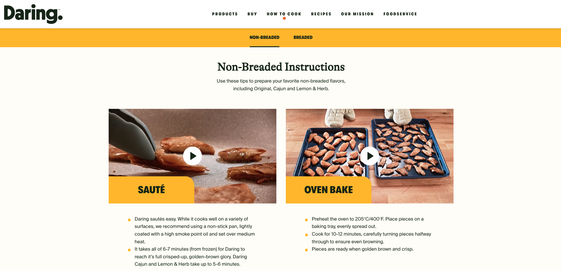
Plant-based brand Daring's redesigned website: Source
The benefits of relaunching your website
Improved customer experience
When reworking your ecommerce experience, you can inspect your current customer experience and determine how you might make it even better. Your site design must have customer experience at its core. This might look like revamping your site design to be more intuitive for shoppers (like OLIPOP’s easy-to-use, yet engaging site:
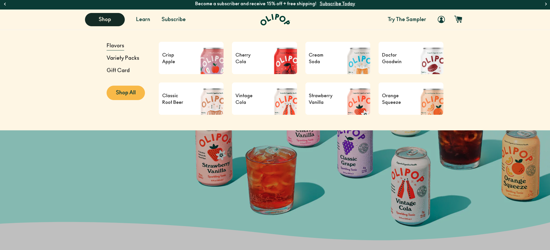
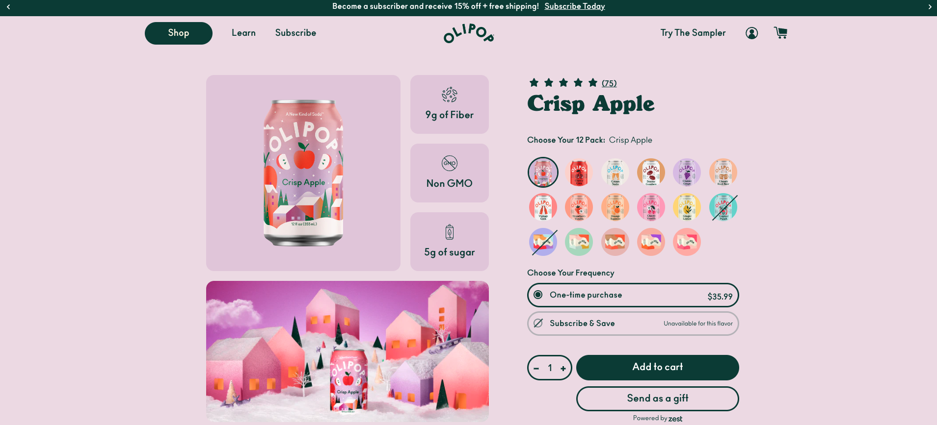
Olipop's website redesign focused on customer experience: Source
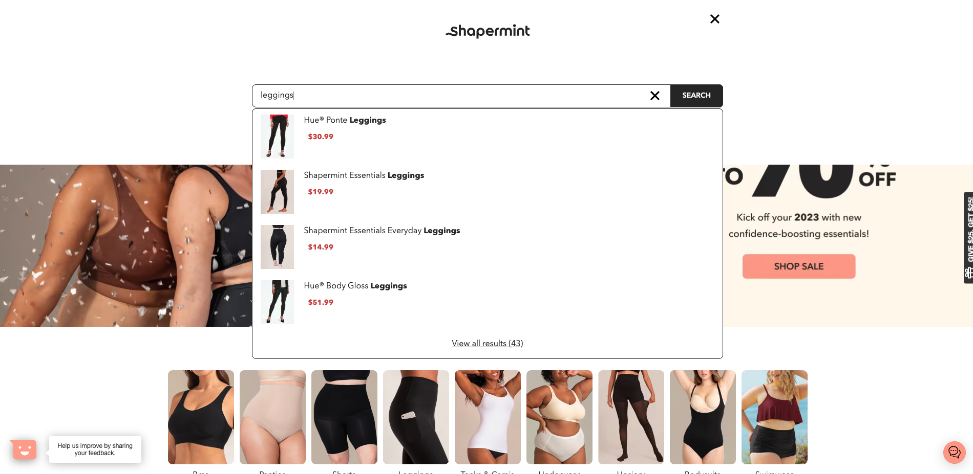
It may look like adding a dynamic search bar to help with product discovery like the one found on the Shapermint website:
Or a quiz that helps with product discovery and reduces churn like TULA Skincare:
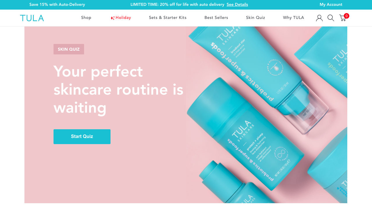
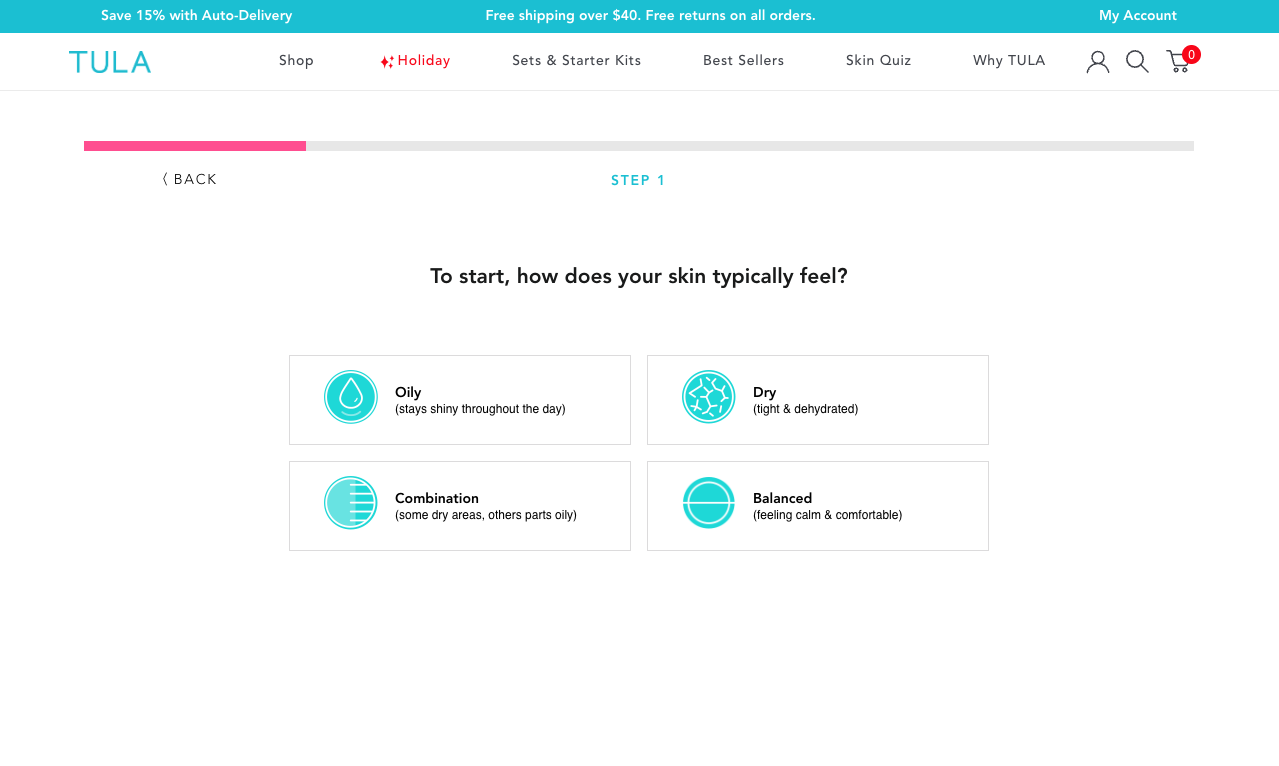
TULA's website quiz helped reduce churn rates: Source
Approaching your new site design from a customer experience lens ensures no stone is left unturned and that you’re offering the best online shopping possible.
Enhanced credibility and trust
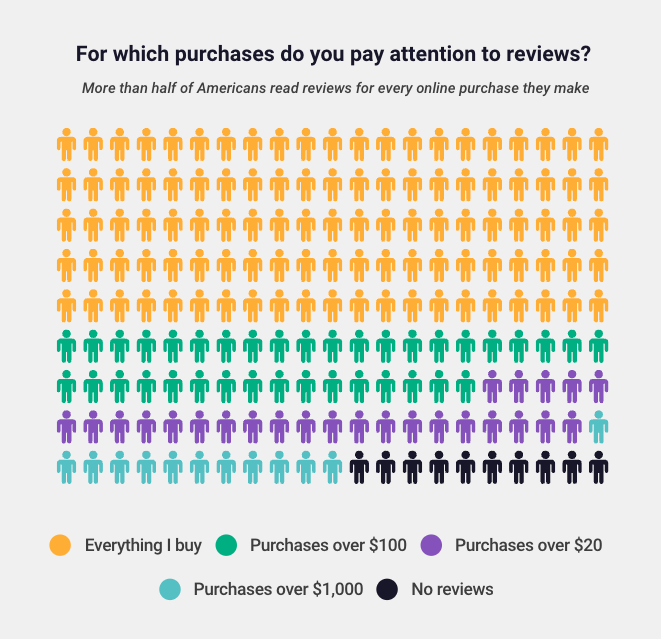
A great ecommerce site not only embodies your brand’s look and feel from a design lens, but it establishes trust with potential customers. Baking social proof into your site design tells customers your brand is legit and worth every penny. With more than half of customers reading product reviews before buying, adding this content to your site is a great way to build trust quickly, especially if your products are at a higher price point.
Increased search engine visibility
If the search engine can’t find your site, how will your customers? Prioritizing SEO best practices (both technical and non-technical) signals to search engines who you are and what you sell, making you more likely to show up when customers search.
Technical SEO best practices include adding metadata to your pages (so Google knows what it’s about when it crawls your site), improving site speed, using the smallest file size possible for images, using an SEO-friendly URL structure, and more.
Non-technical SEO best practices, on the other hand, include creating (educational and/or entertaining) content featuring your products, linking to relevant resources, and more.
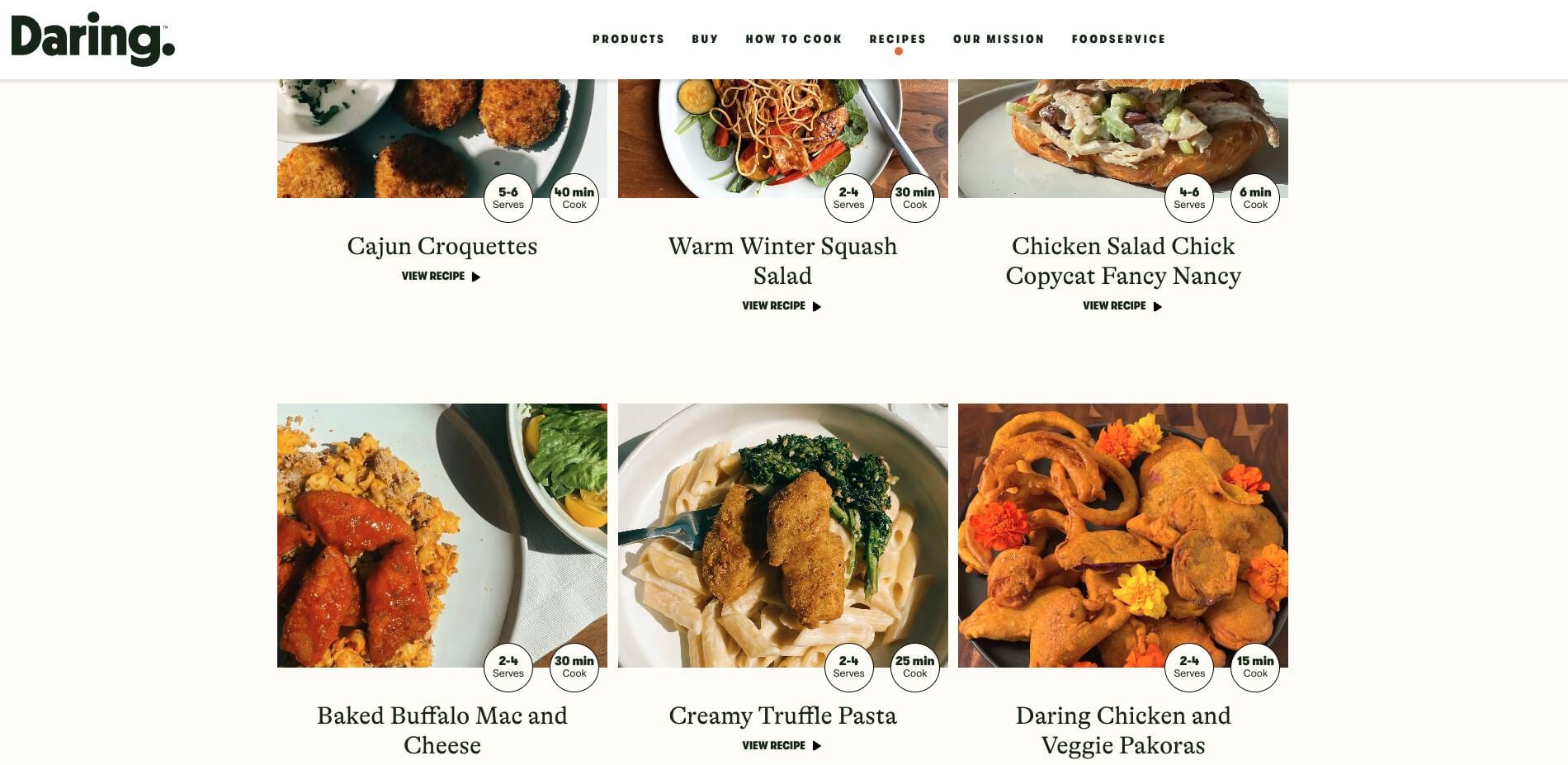
For example, you can create a blog to drive high-quality organic traffic to your website using product-led content. Take a page from technical blanket brand Rumpl, who’s blog features many of their talented artist collaborations:

Content efforts like this can attract the right organic traffic and lead to purchases.
7 Tips to relaunch your website successfully
Ready to relaunch? Check out our best tips for rebooting your ecommerce site and ensuring your launch goes off without a hitch.
1. Audit your existing site
Before you jump into the redesign, run an audit of your existing site. An audit will show you the current state of your site and help you prioritize items for the relaunch.
A few areas your website audit should check for include:
- Technical issues: Are there any blatant issues with how your site is functioning?
- SEO/crawlability issues: Is Google having trouble finding your site and understanding what you sell?
- UX friction points: Are customers dropping off at certain points? Where can you improve things in your purchase journey? Is your checkout process long and complex?
- Forms and quizzes: Are these assets firing correctly, collecting the data you intend for them to collect, and offering customers value?
- Duplicate or outdated content: Is old content negatively affecting your site experience and SEO?
- Site speed: How fast is your site? Are there areas of your site that prohibit a speedy shopping experience (e.g., large file sizes or imagery)?
In the same vein, you may run a competitive audit to see what others in your industry are doing, what’s working well, and where you can differentiate.
2. Set clear goals and objectives for your ecommerce site relaunch
From your audit, you can determine what goals to set for your new site.
For example, if you learn in the audit phase that customers want to learn more about your products, you can optimize your product pages to include more relevant, helpful information, like The Ridge does:
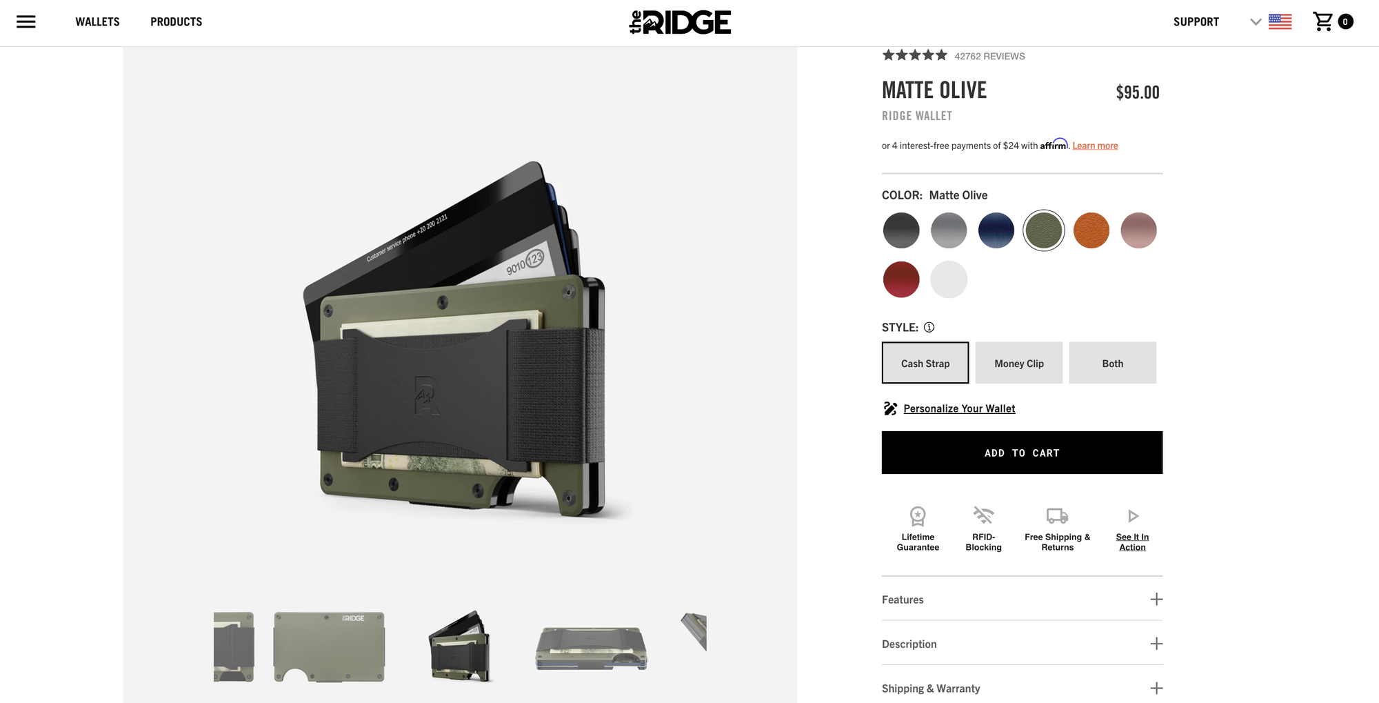
The Ridge includes multiple product images, color and style toggles, and more to give customers a complete view of their signature product. Design your updated site around customer needs to get the best ROI possible on your relaunch.
3. Create a content strategy to attract and retain customers
Your website audit will also help you determine what site content needs to be updated or reworked. Duplicate, irrelevant, and outdated content can harm your customer experience and your SERP ranking.
“Freshness” is a confirmed Google ranking factor, meaning Google prioritizes sites with the most up-to-date content. If your content is collecting dust, it could impact how you rank. Crafting engaging content that keeps customers coming back to your brand has many benefits:
- Position you as a leader and trusted source in your industry.
- Encourage product education, which can lead to purchases.
- Build customer loyalty.
- Help reduce churn.
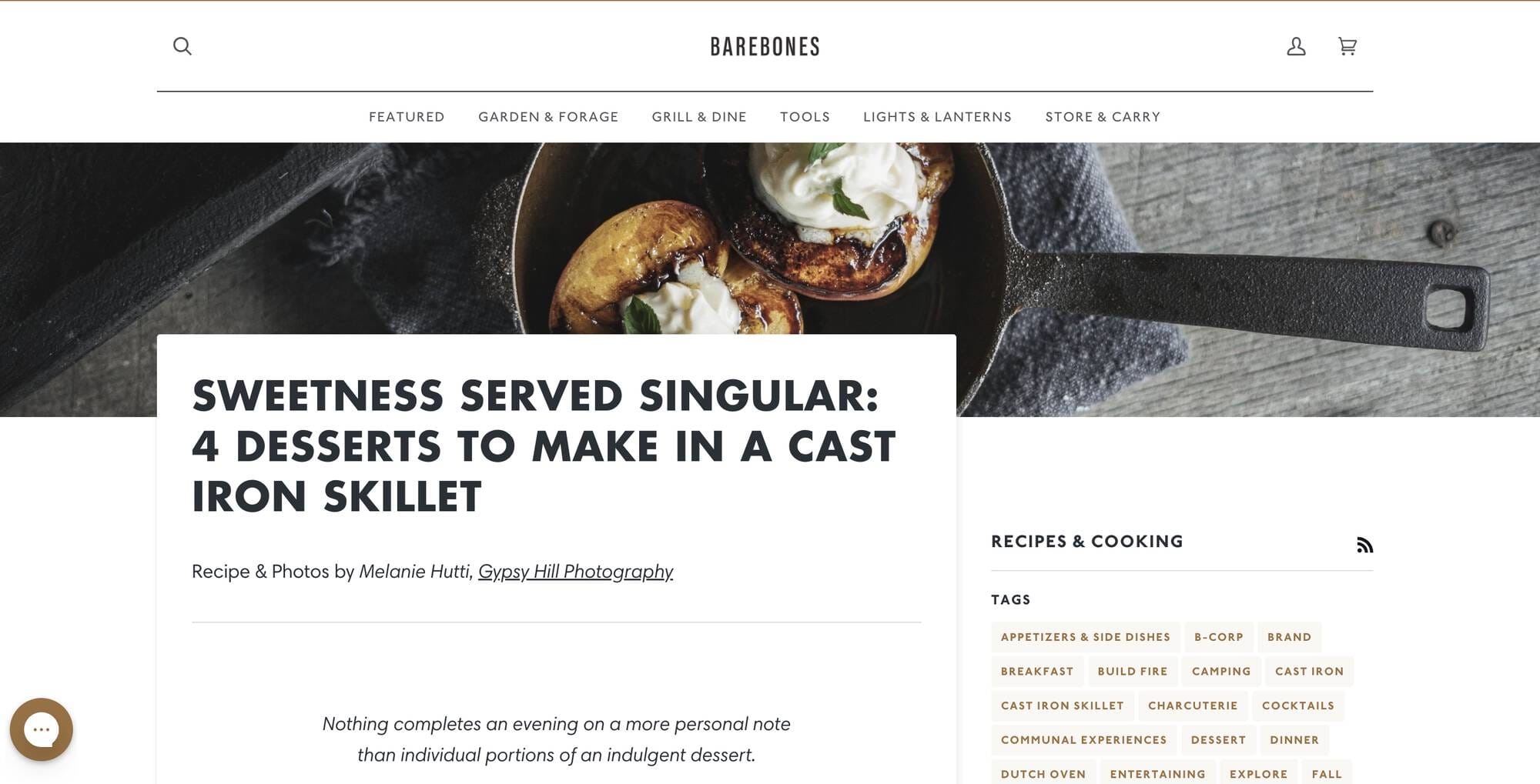
For example, the Barebones Living blog does a great job of balancing relevancy with their products. This blog post on four desserts to make in a cast iron skillet not only includes delicious recipes, but also features relevant products that can be purchased on their site.
Creating fresh content doesn’t just mean keeping up with your blog. It can also mean building quizzes, interactive experiences (like Nike’s app), and personalized content (like IKEA does with multi-store functionality).

4. Redesign your site with your customers at the forefront
The core of every memorable site design is how easy it is for customers to do what they came to your site to do—purchase, browse, or ideally, both!
When approaching your site relaunch, think about what you want customers to do and optimize for that. Understand where they are in their customer journey and build funnels to encourage purchase without friction. For many, this can start with a landing page that matches the message and intent of the customer in their journey.
For example, if you want to drive more purchases, reduce any friction with your checkout flow. Make it as easy as possible for customers to go from browsing to order confirmation.
5. Optimize your site for search engines
As mentioned above, for your site to be discoverable, it needs to send the right signals to Google via metadata, alt tags, keywords, etc.
Here are a few technical ecommerce SEO best practices to keep in mind as you relaunch your ecommerce site:
- Use a crawlable and indexable site structure: Make sure that your website's structure is easy for search engines to crawl and index. This includes organizing your content into categories and subcategories and using clear and descriptive URLs.
- Use relevant and unique title tags and meta descriptions: Title tags and meta descriptions are important for SEO because they appear in search results and help to give context to what a page is about. Make sure to use relevant and unique title tags and meta descriptions for each page on your site.
- Optimize product pages: Optimize these pages by including high-quality product images, descriptive and keyword-rich product titles and descriptions, and relevant product tags.
- Use a sitemap: A sitemap is a file that lists all of the pages on your website and helps search engines to understand the structure and hierarchy of your content. Make sure to create and submit a sitemap to help search engines index your site more effectively.

6. Develop a launch announcement strategy
Drumming up some buzz about your new site launch is a great way to get customers excited about something new. A launch strategy can also include a gameplan of how you plan to mitigate post-launch hiccups to ensure no loss in service.
Here are a few points to consider when creating your launch announcement strategy:
- Highlight the new site benefits: This could include faster load times, a more user-friendly interface, new features and functionality, and more.
- Set expectations: Let customers know what to expect from the relaunch process, including any downtime or changes to your site. This can help to manage expectations and minimize any disruptions.
- Use multiple channels to share the news: Use a variety of channels to announce your website relaunch, including your website, social media, and email marketing. This can help to reach a wider audience and generate buzz about your new site. For example, premium whiskey brand Glenmorangie posted this announcement to their LinkedIn page complete with an engaging video to capture attention:

Follow up and gather feedback: After your website relaunches, follow up with your audience to gather feedback and address any issues that may arise. This can help to ensure that your new site is meeting the needs of your audience and is performing as well as possible.
7. Test your website before launching (and continue to test post-launch)
Continuing to test your website post-launch (and any time you make an update) is always a best practice.
Below are a few types of testing to add to your website relaunch plan:
- A/B testing: A/B testing involves comparing two versions of a website or web page to see which performs better. This can be a useful way to test different elements of your website, such as the layout, color scheme, and calls to action.
- User testing: User testing involves asking real users to interact with your website and provide feedback. This can help you to identify any issues or areas for improvement from the perspective of your target audience.
- Analyze site data and monitor performance: Use data analytics tools to track key metrics such as traffic, conversion rates, and revenue. This can help you to understand how your website is performing and identify any areas for improvement.
- Gather feedback: Encourage your customers to provide feedback on your new website. This can help you to identify any issues or areas for improvement and ensure that your website is meeting the needs of your audience.
A successful website relaunch can mean big results for your brand
The potential impact of a successful website relaunch on your business is nothing to bat an eye at. By carefully planning and executing a website relaunch, you can create a more modern, user-friendly, and visually appealing website that better reflects your brand and better meets the needs of your audience.
Kat Ambrose is a content marketer at Shogun, where she creates value-driven ecommerce content for scaling brands. When she isn't working, you can find her out for a run or trying to pet the nearest dog.