One of the things the best brand communities have in common is visual appeal. From the colors and logos they use to their tone of voice, every part of their brand identity has been carefully chosen to build a unique, beautiful experience for their customers
These elements are all things that can immediately grab and hold a customer’s attention. Think about your favorite brands — what is it that first drew you to them? Chances are they made an incredible first impression with a beautiful customer experience and have successfully woven that experience into every interaction you have with them.
These beautiful, immersive experiences make it easy for your customers to associate a feeling of joy with your brand. This type of powerful emotion helps build strong connections that will make your brand community stand out from the crowd.
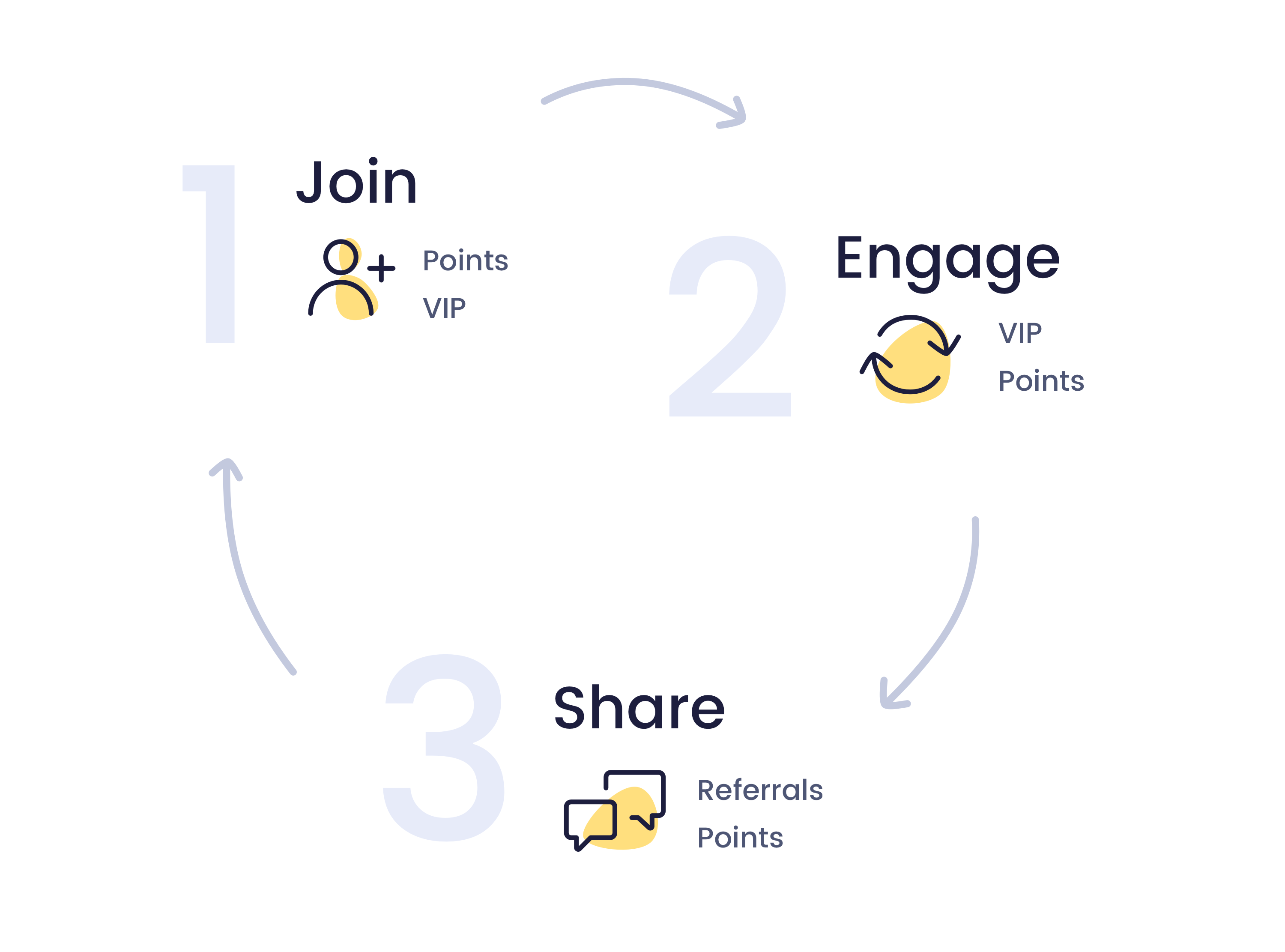
With this in mind, it’s incredibly important that your rewards program becomes a seamless extension of your brand. Ensuring your rewards program offers customers the same beautiful experience they’ve come to know and love on your site gives every shopper a compelling reason to join, engage with, and share your brand community.
That’s why we’ve made some significant (and amazing!) improvements to your Smile UI. We passionately believe that these new design customizations have made building an engaging brand experience easier than ever.
I’m really excited to show you how you can use these new features to get the most out of your brand community and know you'll leave inspired to make these changes to your own program!
Make a stronger first impression
When it comes to building your brand community, first impressions really count. That’s because this first interaction is really your only chance to give them a compelling reason to join your community.
Luckily, you already have all of the ammo you need to get customers truly excited about it! Brand assets like your logo, colors, and tone of voice are what attracted customers to your store in the first place, making them the perfect tools to help you build an exciting community that every customer will want to be a part of.
Make your program more recognizable with a Launcher icon
Building a strong first impression all starts with a beautiful Launcher. Your Launcher is one of your most visible program elements, which is why it’s often the first interaction a member will have with your program. Each time your Launcher loads on your site is an opportunity to showcase your program and grab your customers’ attention, moving them one step closer to joining your community.
Your logo is the perfect way to do this. Adding your logo to your Launcher makes your program feel like a natural extension of your brand experience because it's one of your most recognizable features. As your brand's easiest defining feature, it's also one of the simplest ways to remind customers of the joy they feel at every stage of your customer experience.
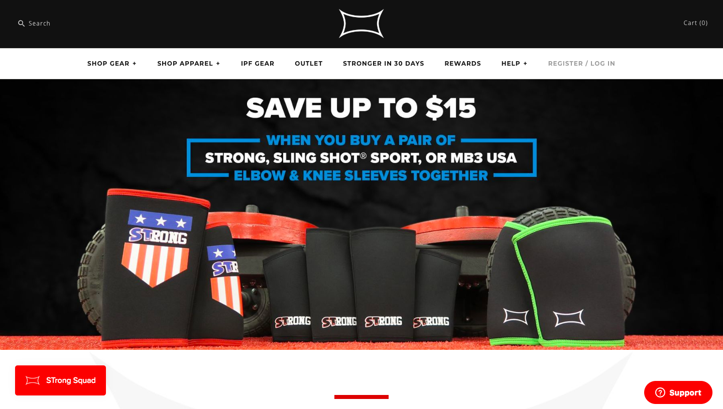
Mark Bell Sling Shot does an amazing job of connecting their rewards program to the rest of their online experience. One of the first things you see when you land on their homepage is their distinctive logo, right in the middle of the navigation bar. By adding their logo to their Launcher they make it easier for their customers to recognize their program as an extension of their brand community, moving them one step closer to joining their program.
Offer a seamless brand experience with consistent colors
Color is one of the quickest ways for your customers to identify your brand. With the power to evoke any number of emotions, your brand colors are one of the strongest visual markers of what makes your brand unique.
As a result, applying your brand colors to your program’s banner, buttons, icons, and Launcher makes it easier for customers to see your program as part of a seamless brand experience. When your customers see similar colors throughout your rewards program and other touchpoints (such as email communications and social messages) it’s easier for them to connect all of these experiences back to your brand.
This in turn makes it easier for them to associate the feelings of joy they’ve had throughout your customer experience with your program, making it more desirable to join and stay engaged with over time.
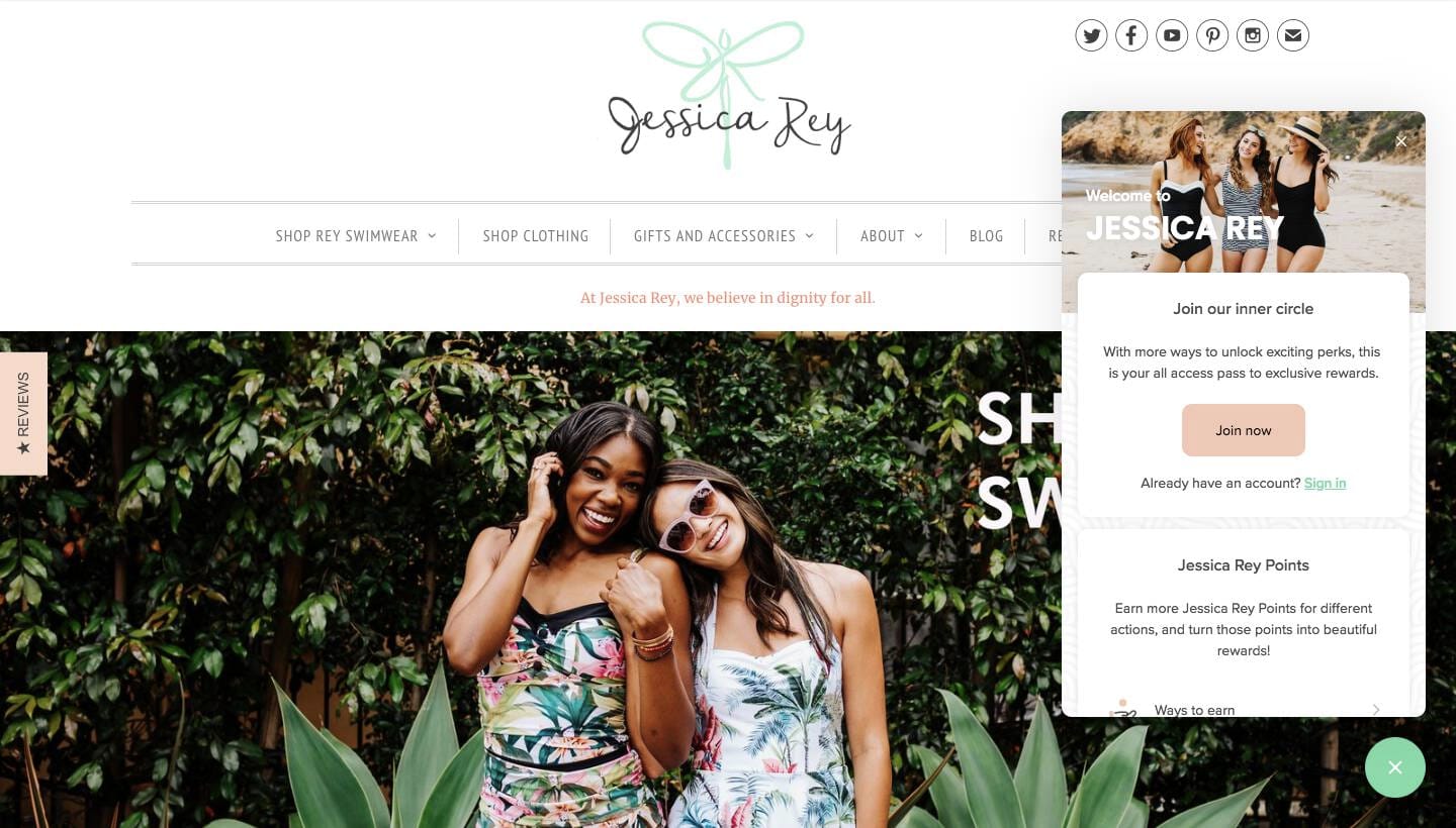
Jessica Rey does an incredible job integrating their primary and secondary brand colors throughout their program by applying them to their buttons, links, icons, banner and Launcher. When customers make the visual connection between their logo colors and customer Panel they are more likely to trust the value being offered, giving them even more reason to join their community.
Encourage visitors to join your brand community with custom text
Now that customers are looking to make an emotional connection with the brands they shop with, your brand voice is more important than ever. With the ability to humanize your brand and tap into a powerful sense of belonging, the words you use to present your program have a huge impact on how much your customers want to join.
By adding custom title and description text to your account creation card, you can give your customers a sense of who you are, what your community is about, and what they will gain when they join.
This all works together to position your community as a place your customers want to be that will resonate with their desire to belong to a group of like-minded individuals. It’s this emotional connection that will make them more likely to join your program and, hopefully, want to share it with others.
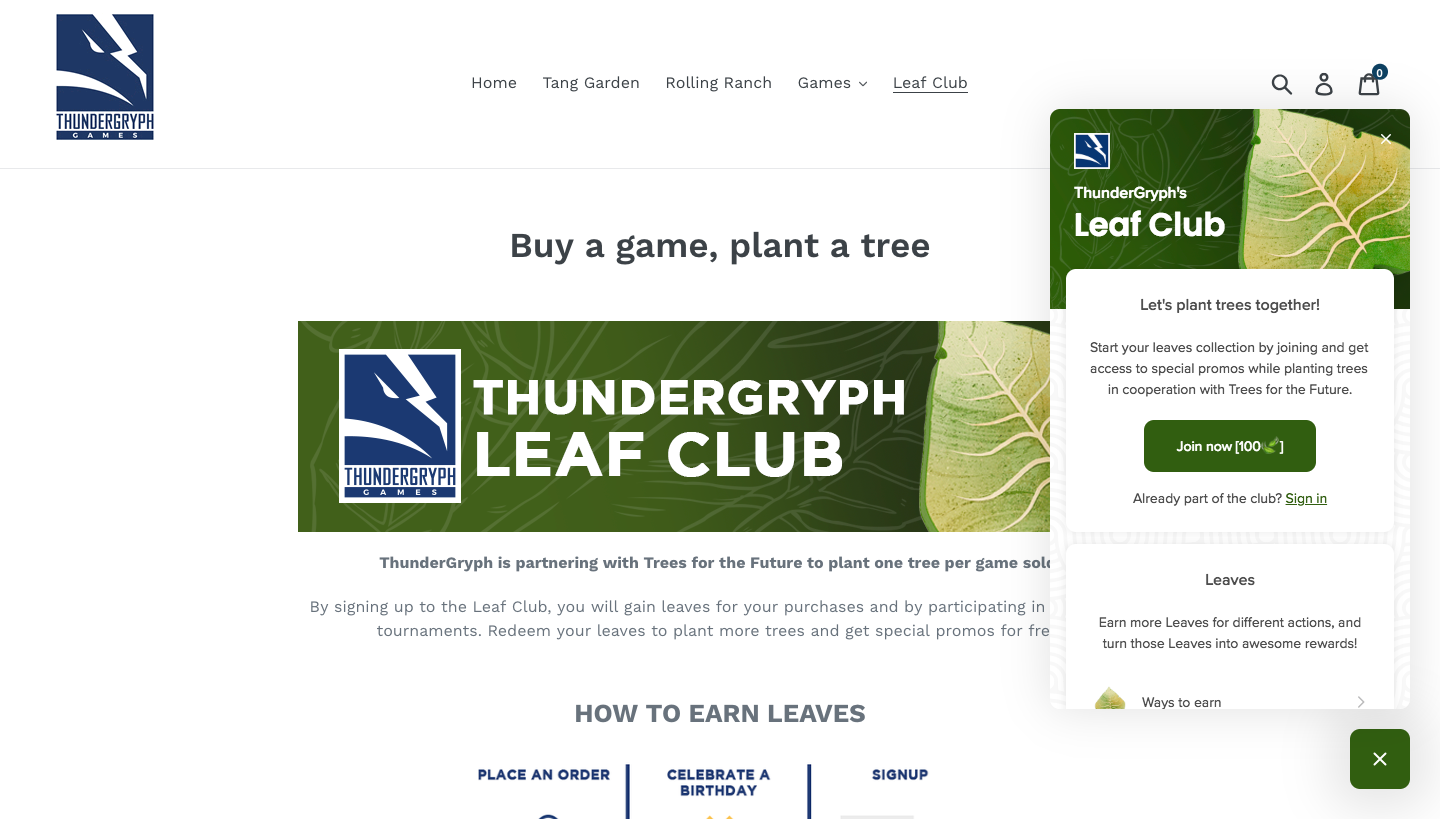
ThunderGryph Games makes incredible use of their account creation card by using it to give their site visitors a clear understanding of what they’ll gain when they become a member. They’ve made their first impression even stronger by connecting their rewards program to a social cause, allowing their members to not only earn points but give back to the environment.
With the text on their account creation card, they've built a community that their customers will want to be a part of, making them more likely to join their program.
Build a more engaging experience for rewards program members
While encouraging customers to join your brand community is a great first step, it’s only one piece of the community building puzzle. If you want your community to truly succeed, you also need to find ways to encourage your members to engage with and share your community with others.
You can do this by optimizing your member experience. By paying attention to the ways your members engage with your program, you can can intentionally build an experience that will grab and hold their attention, giving you a chance to showcase all of the amazing benefits they have as part of your brand community.
Catch their eye with a beautiful banner image
When you are separated from your program members by a screen, the images that you choose to represent your brand are a huge opportunity to build an emotional connection with your customers. Similar to the time and care you put into choosing images for your site, social channels, and emails, the visuals you use throughout your program should fit seamlessly with the rest of your brand experience.
As one of the first things your members see after logging into your program, your banner image has a huge impact on your community’s engagement. When your banner image catches their attention your members will be more likely to explore other elements of your program Panel, moving them one step closer to engaging with your program.
Cheekys is a great example of a brand with a gorgeous program banner image that really captures your attention. Your eye is immediately drawn to the unique Cheekys Junkies logo they’ve included in their image, which is every bit fun and original as the clothing and accessories they create. By drawing their members’ attention with a beautiful image they’ve moved them one step closer to engaging with their program.
Building excitement with an exciting status
There are few feelings as satisfying as finally achieving something, and your rewards program gives you a number of ways to play up this emotion. Whether it’s letting them know how close they are to their next reward or how many friends they’ve successfully referred to your brand, your program members want to know they’ve reached these types of goals.
That’s why your Panel’s program status area is so instrumental to expanding your brand community. When you use this are to show your customer’s their points total, number of referrals made, or their current VIP tier, you’re able to celebrate their successes with them and further strengthen the emotional connection they have with your brand.
These aren’t the only ways you can use it, though. If you’re running a bonus points event, why not update the program status to highlight the total number of points your members have redeemed? Similarly, if you’re running a campaign for your VIP members, why not showcase their current tier to keep them motivated to reach the next one?
Showing your customers their progress towards any of their rewards achievements can be a powerful motivator for them to continue engaging with your community, connecting with their desire to feel that sense of achievement. When their actions are motivated by this desire, they’ll be more likely to stay engaged with your community and remain loyal to your brand as a result.
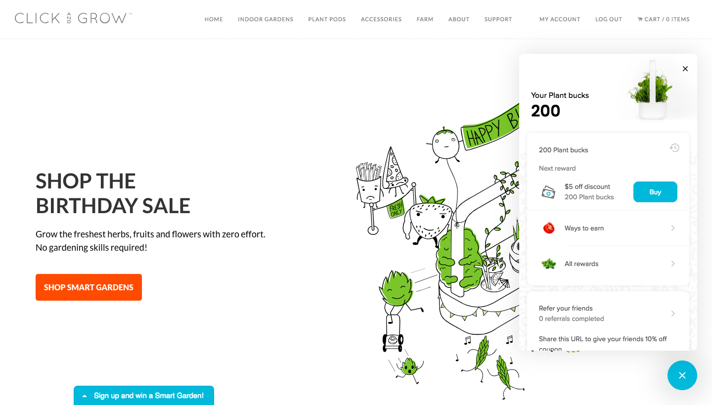
Click and Grow makes great use of their program status. Members can see their current PlantBucks balance and progress towards program rewards, providing that extra bit of motivation to stay engaged in their community.
Give your members a reason to share your community
Referrals are a great way to build a two-way relationship with your customers. When your customer feels like your brand experience is more invested in their interests than your brand’s, they’ll want to share their experience with others. It’s these feelings of reciprocity that start to build an emotional relationship with your customers, which will keep them coming back to your store again and again.
Your referral program details card should be a reflection of the unique, beautiful brand experience that initially drew your customers to your store. Customers will feel more comfortable sharing your referrals when they know it represents the reasons they initially joined and engaged with your community in the first place.
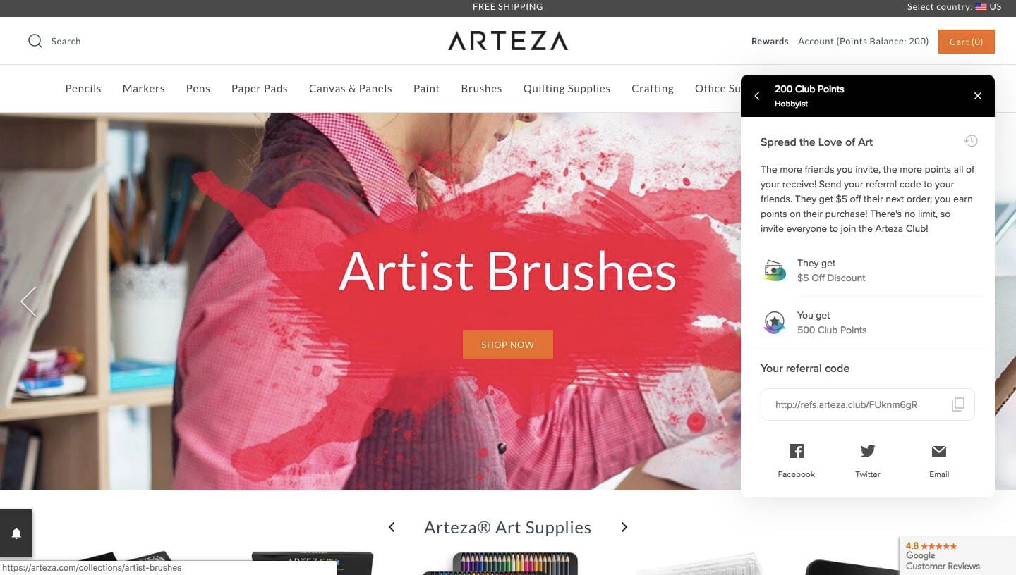
Arteza does an amazing job of weaving their brand voice into their referral cards. As an art supplies store, the love of art is definitely one of the things that drew their customers to their store in the first place. Adding custom text to their referral card taps into their members' desire to share their experience with other art lovers and delivers a beautifully crafted experience to boot.
Build a community that your members want to join, engage with, and share
Customers want to feel a sense of joy, belonging, achievement and reciprocity when they’re looking to make their next purchase. Building these emotional connections into every aspect of your brand experience is what will help you stand out from your competitors and keep your customers coming back to your store.
The new design features we’ve introduced will make it easier for your customers to see your program as a natural extension of your program. When they make this connection, they’ll start to associate the positive feelings they’ve had with your brand with your program making them more likely to join, engage with, and share your brand community. These are the 3 actions that will help grow your community sustainably and empower your customers to get involved in that process.
Since we’ve only covered a few of the new things you can do with your rewards program in this post, I’d recommend heading over to the Smile app for even more inspiration!


