

Guest Post by Iryna Mosiiuk is Co-Founder of Mgroup
In Short
Most Shopify brands with a loyalty program have put real work into it. They've set earning rules, designed VIP tiers and written the emails that remind customers about their balance. Then a shopper lands on a product page, the one place where they're deciding whether to buy, and the program is nowhere to be seen. Unless they notice a small button in the corner, nothing tells them this purchase earns them anything.
We're Mgroup, a Shopify agency, and we spend a lot of our time inside product page templates. In this article we'll show you what we found when we looked at the product pages of five stores running Smile, why loyalty points on the product page are so often missing, and what happened when we switched them on for one of our clients, Tahiro. At the end there's a short checklist you can run on your own store this week.
We opened the product pages of five stores running Smile
In November 2026 we opened a product page on five Shopify stores that run Smile. We scrolled the whole page, let every widget load, and looked for any mention of points.
None of the five showed points next to the product. Every one of them had the floating launcher, the button in the corner that opens the rewards panel, and that was all.
This isn't a list of weak programs. Monos has unlocked $8M with its loyalty strategy, and Sloane Tea boosted revenue by 370% in 24 hours with bonus points. These programs clearly work. They still leave the product page empty, which tells you the gap has nothing to do with effort or strategy. It comes down to a setup step that's easy to miss.
A caveat before we go further: we checked one product page per store, on one day. Treat this as an observation rather than a study. We also looked at a few stores on other loyalty platforms, and only one of them showed points on the product page. Even there, the points sat below the add-to-cart button.
Why loyalty points disappear from the product page
Smile splits its on-site content into two groups. The floating launcher and nudges work from day one. Everything under Embedded content, including Points on product page, starts with a Set up button and stays invisible until someone adds it.
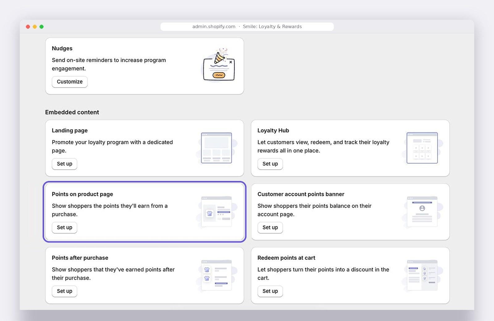
Smile's On-site content settings. The launcher is already live; Points on product page still needs to be set up.
That's the first reason points go missing. The part that appears automatically is the part that sits in the corner.
The second reason only becomes obvious once you switch the feature on. Points on product page is a Shopify theme app block. When you click Add to theme in Smile, the block is added to your default product template, and its position is controlled in the Shopify theme editor. Smile recommends placing it near the price. The block doesn't move there by itself, though, and if your theme uses more than one product template, each of the others needs the block added by hand.
So a merchant can do everything right in Smile and still end up with points on some products and not others, or with points on every product in a spot nobody looks at.
What happened when we switched it on
Tahiro is one of our clients, a supplement brand that runs its rewards program on Smile and sells a large share of its range on subscription. (You can read more about our Shopify work for Tahiro.) We used their Algae Omega 3 Oil page to walk through the three states a product page can be in.
Before: the launcher and nothing else
With the default setup, the only sign of the program was the Rewards launcher in the bottom corner. Nothing near the price or the add-to-cart button told shoppers that this purchase earns points.
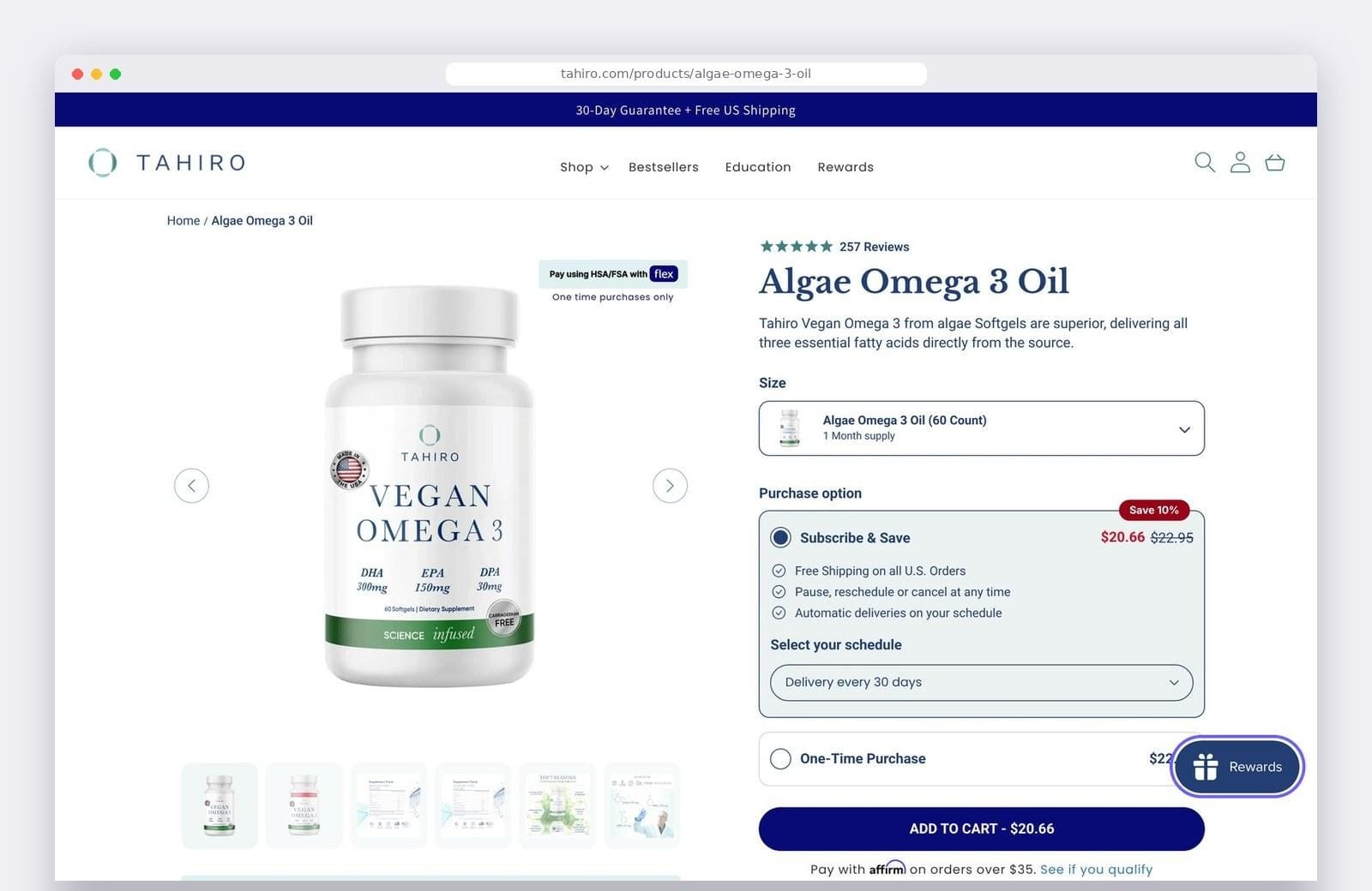
Default setup. The Rewards launcher in the corner is the only sign of the program.
The launcher does its job. It opens the rewards panel for shoppers who already know to look for it. But a shopper deciding whether to buy is looking at the price and the button, not at the corner of the screen.
After Add to theme: points, two screens down
Next we enabled Points on product page using Add to theme. The block appeared and did its job: "Earn up to 22 Points when completing this purchase."
It also appeared at the very end of the product column, after the Description, Supplement Facts and Recommended Use sections. On desktop it was around 1,170 pixels from the top of the page, on a screen 900 pixels tall. On mobile it was roughly two screens below the add-to-cart button.
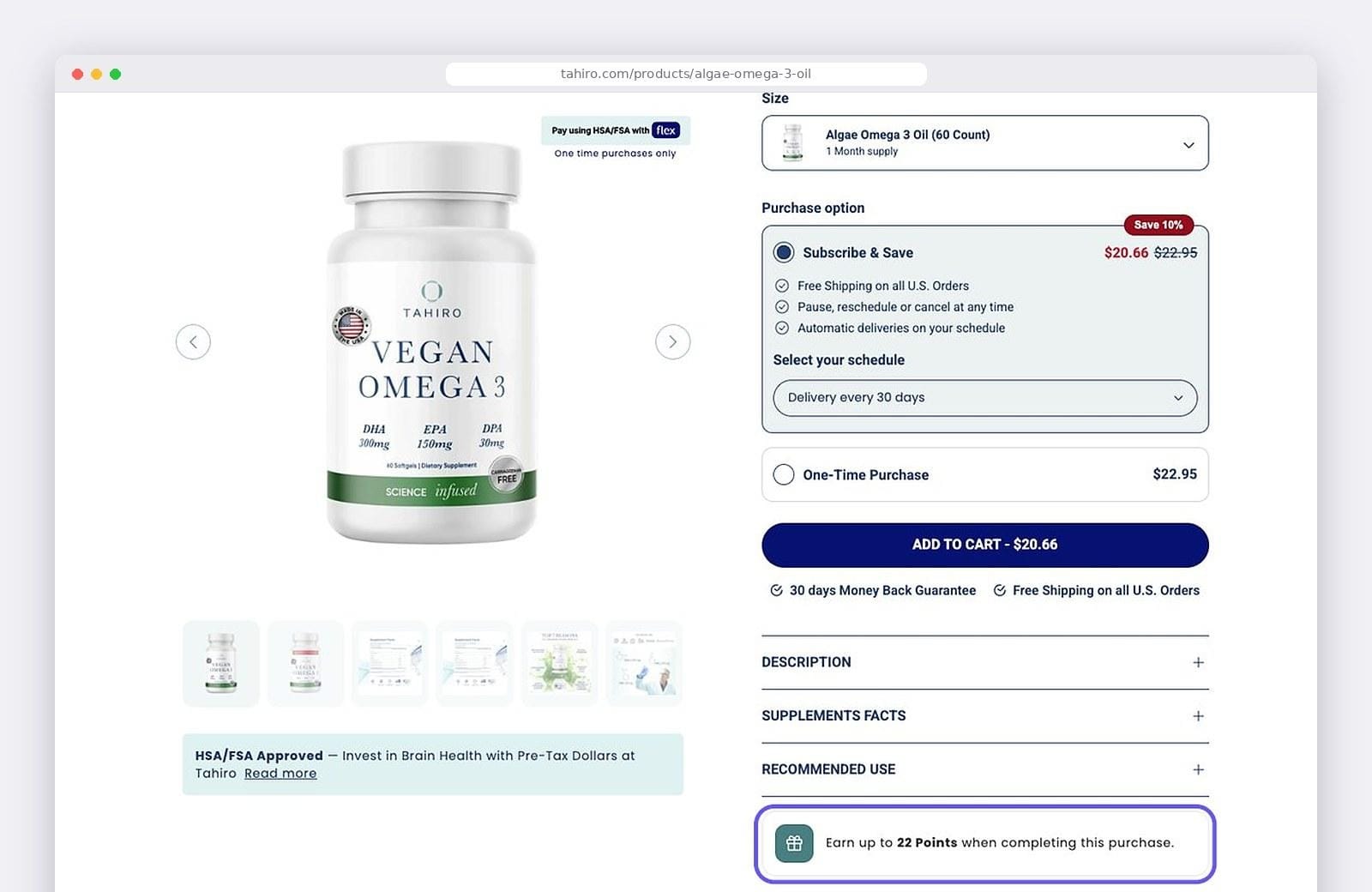
After Add to theme. The points block sits below every accordion, well after the add-to-cart button.
Technically the feature was on. A shopper deciding whether to tap Add to cart would never have seen it.
Placed on purpose: points next to the decision
Finally, here is the same block moved up so it sits directly below the add-to-cart button, next to the money-back guarantee and free shipping line.
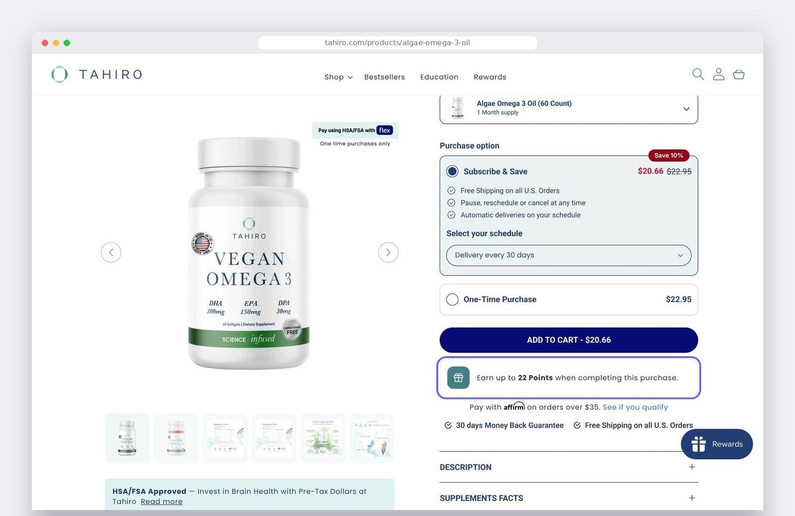
The same block, placed directly below the add-to-cart button.
Nothing about the block changed. Same text, same styling, same app. The only difference is where it sits, and that's the main point of this article. Turning the feature on is half the job. Placing it is the other half, and it's the half that usually gets skipped.
Where to put loyalty points on the product page
Smile's own advice is to place the block near the price. In practice you're choosing between two spots around the buy button, and the right one depends on your theme.
Above the add-to-cart button
Shoppers see the points before they click, so the reward becomes part of the decision instead of a pleasant surprise afterwards. The cost is that you're adding something between the price and the button. On a page with several variants or purchase options, that pushes the button further down.
Below the add-to-cart button
The path from price to button stays clean. The points sit alongside the other reasons to buy, like guarantees and free shipping, and read as one more of them. The trade-off is that some shoppers will click before they look below the button.
Baymard makes a similar argument about other information shoppers need at this stage. In their product page benchmark, 67% of sites don't provide a total order cost estimate near the buy section, even though that's exactly where people decide whether to add a product to their cart. Points are the same kind of information. They're useful at the moment of decision and easy to overlook anywhere else.
On mobile, check for a sticky add-to-cart bar
This is the one that catches people out. Plenty of Shopify themes hide the regular add-to-cart button on mobile and replace it with a bar pinned to the bottom of the screen. Tahiro's theme does exactly that.
When the button is pinned, "above or below the button" stops meaning much, because the button isn't part of the page flow anymore. On Tahiro, the block that sits just below the button on desktop ends up directly under the purchase options on mobile, since the in-page button is hidden there. Shoppers see their points while they choose between subscription and one-time purchase, and the pinned button stays where it is.
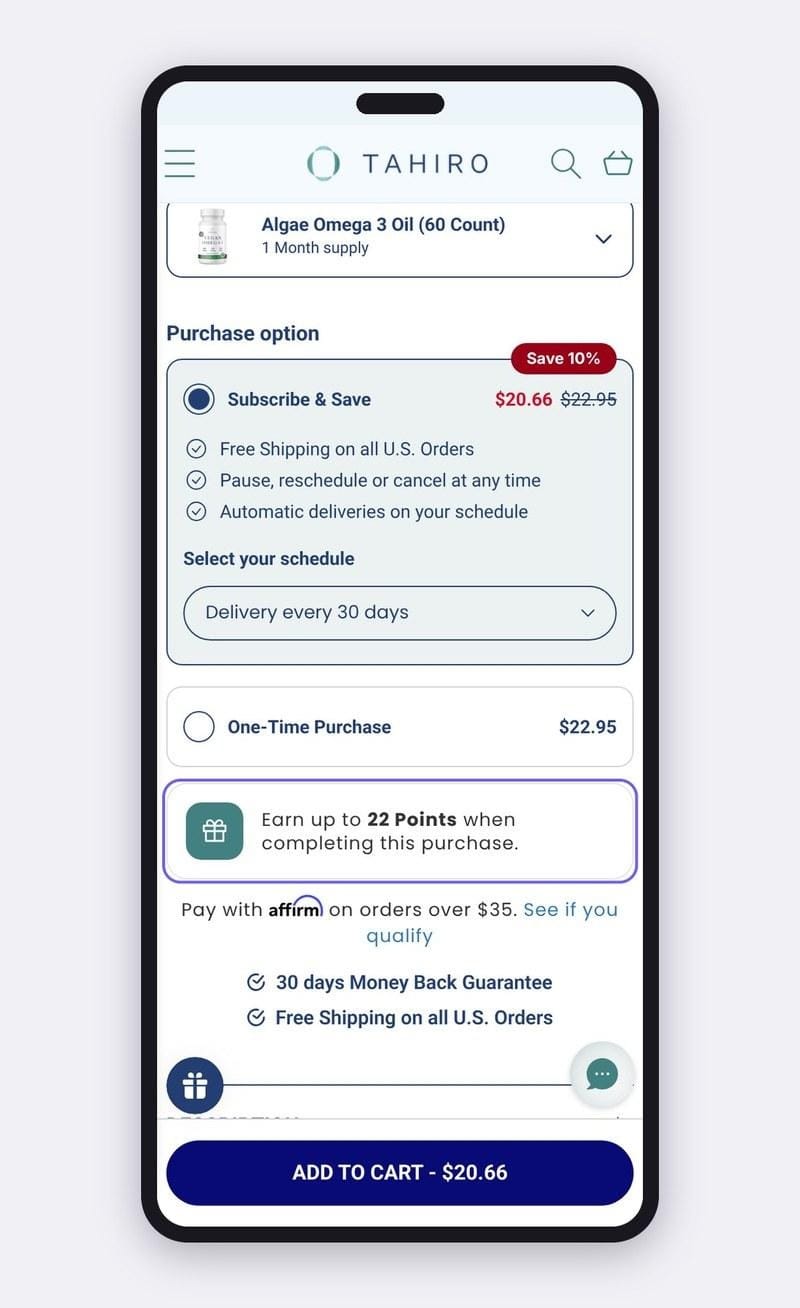
Mobile, with a sticky add-to-cart bar. The points sit right under the purchase options.
In most themes the block order is the same on desktop and mobile, so a position that works on one can look quite different on the other. Check the result on a real phone, not only in the theme editor preview.
Details that trip up implementations
A few things we ran into that are worth checking before you call the job done:
A 15-minute checklist for this week
Your loyalty program already gives shoppers a reason to buy from you rather than someone else. The product page is where that reason needs to be visible.
Iryna Mosiiuk is Co-Founder of Mgroup, a Shopify agency that builds and optimizes stores for merchants in the UK, the US and Europe.
